ARCHITECTURAL + INTERIOR PHOTOGRAPHER // ATLANTA + BEYOND…
T A K I N G T H E P H O T O G R A P H I S O N L Y H A L F T H E B A T T L E . . . C R A F T I N G A N I M A G E I S W H A T S E T S I T A P A R T
A common misconception in architectural & interior photography is thinking that we just show up, snap some shots, upload them, tweak a few colors, send them over and that’s it. However, this type of photography takes a tremendous amount of work on-site and in post-production to end up with the final images that are delivered to the client. Hopefully this page can educate everyone on how these images are produced and the time and effort that is put in to make them come to life. Images (and I say ‘images’ because they are more than just a single photograph) can take anywhere from 30 minutes to a full day to edit each one. Ultimately, my goal is to help everyone understand the value and importance of hiring a specialized photographer in order to justify your investment and trust that I will give your project the care and attention to detail that it deserves. With that being said, please scroll down and enjoy the dramatic transformations!
Compare a normal single-exposure photo to my fully produced, staged, and retouched images
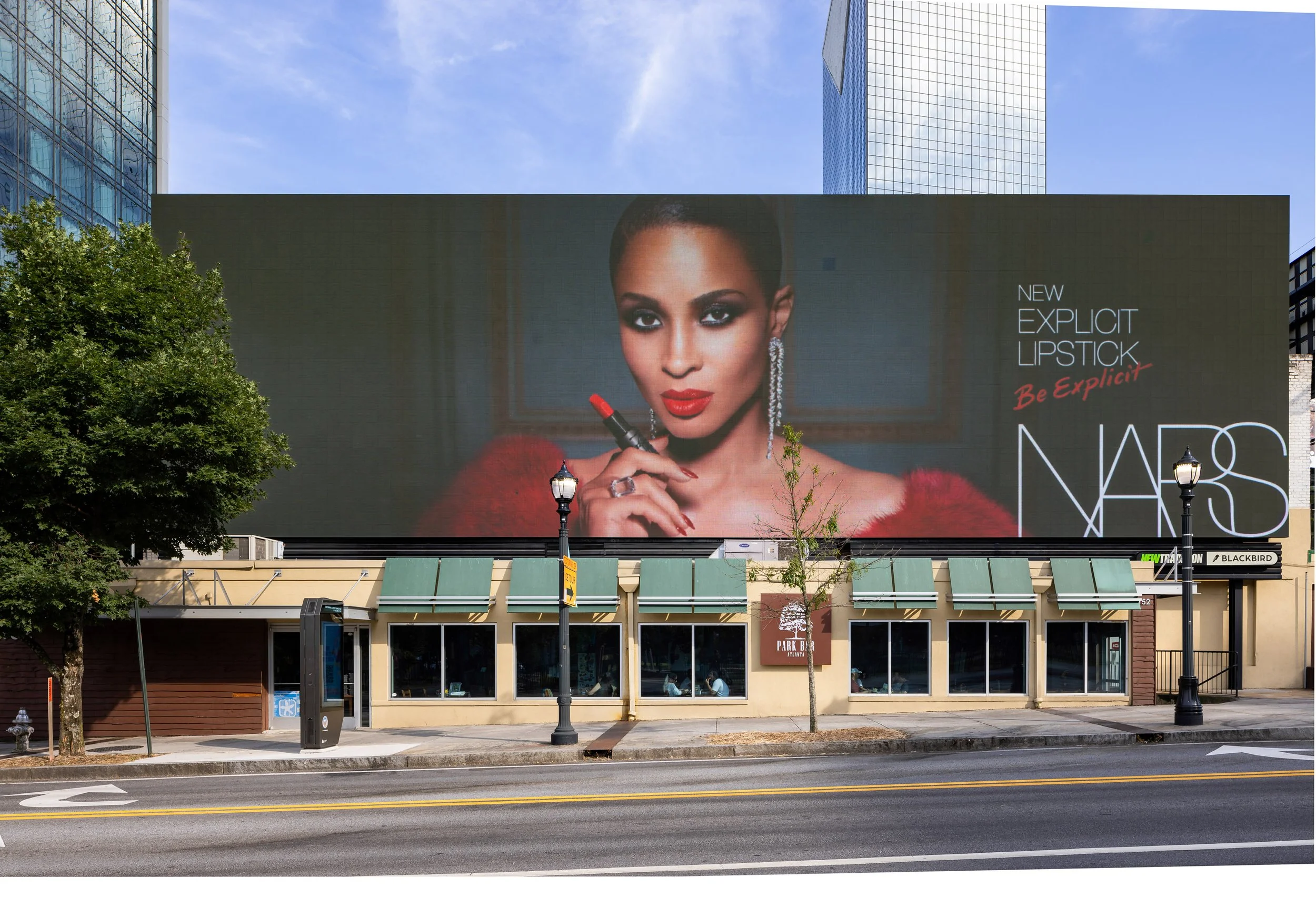
The focus here was the digital billboard, so we just needed to eliminate all the distractions for a clean finish. This is considered extensive retouching since a lot of work went into removing the tree and the light posts. I even had to track down the font name for the Park Bar’s logo to recreate the letters.

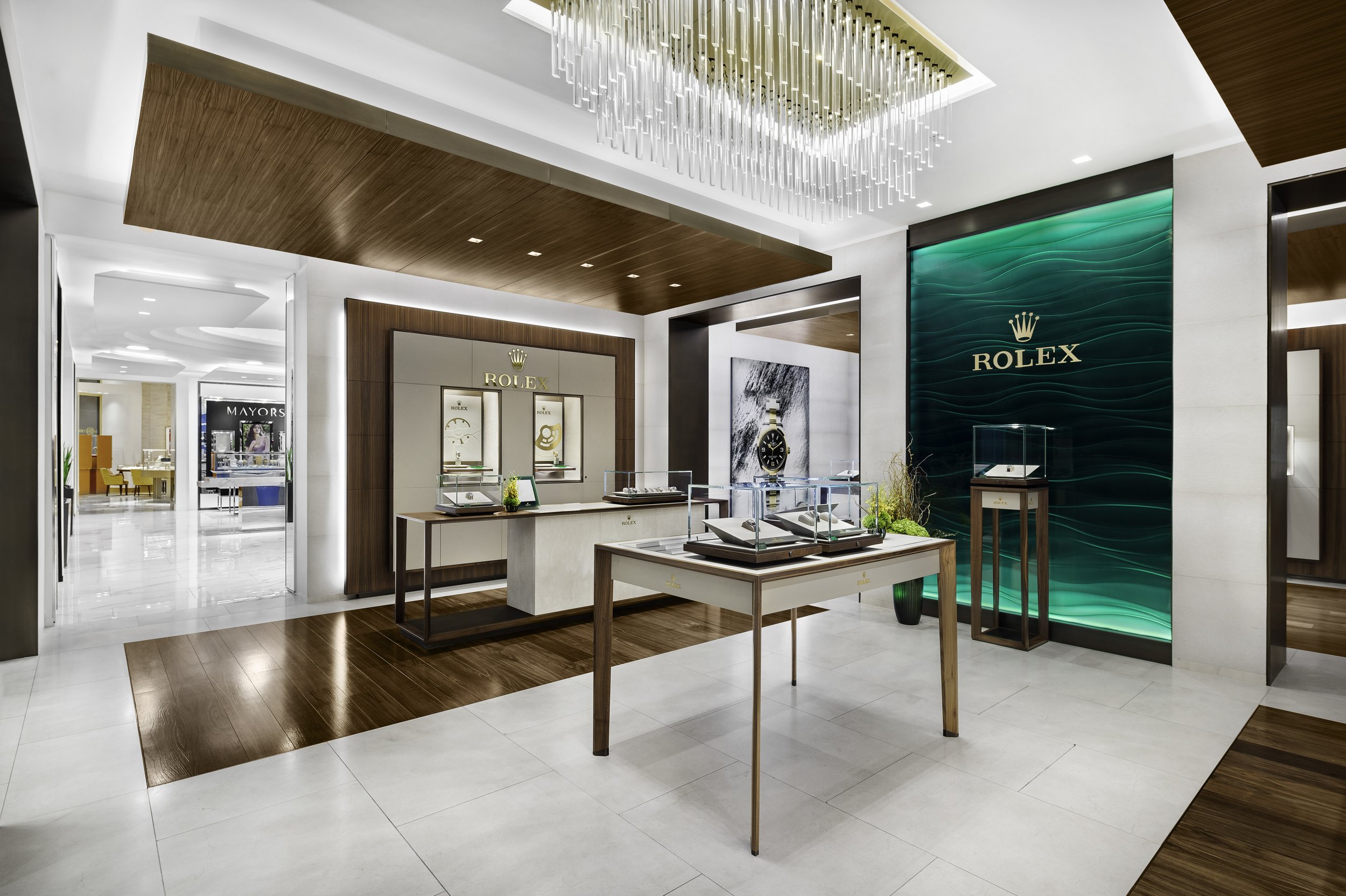
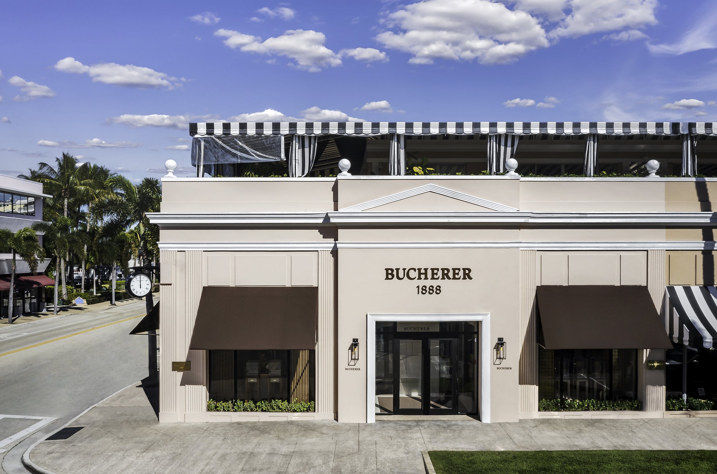
I’ve been fortunate to have captured over 65 stores throughout the Southeast for Rolex over the past few years and it has helped improve my process from start to finish. I only have two hours to capture about twenty views before the store opens so it’s a mad rush to compose each view and to block the MANY reflections that appear on their infamous green glass branding wall for each view, using only ambient light. During post-production, I spend about 2 hours per each final image to blend the exposures, mask-in the areas that I blocked for all the reflections, retouch out all the distractions, replace wall-graphics, perfectly match all the colors and wood finishes, and sometimes I even have to replace the watches if inventory is low (which is often!). It’s a labor of love but they are such a joy to work with and easily one of my favorite clients.
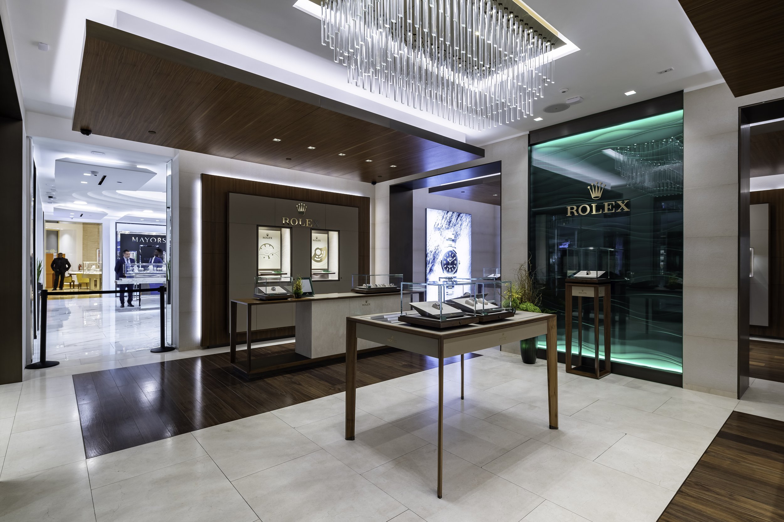
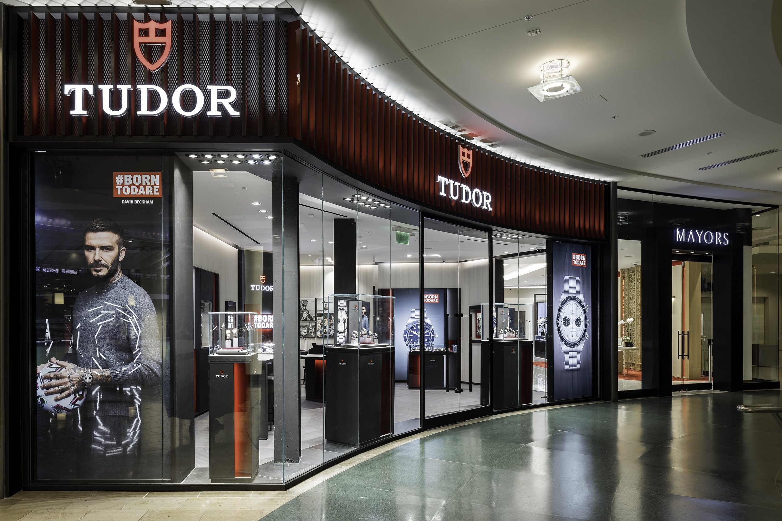
Not even David Beckham is impervious to nasty glass reflections. Often times, my circular polarizer filter can eliminate some of the glare off of glass, tile, and wood surfaces, but it’s no David Copperfield and can’t make them totally disappear. In these cases, I use my trusty DIY “magic reflection blocking thingy” to hold up and block reflections coming from other neighboring stores. (It’s basically just a big black sheet attached to two telescoping dusting poles…super fancy, I know). It usually takes many frames of me holding it up with one hand and firing my camera via my iPad in the other hand, taking a small step and repeating the process until I have every distracting reflection blocked. Then I just painstakingly mask-in each area that I blocked from each frame into my base image to make sure we can see all the pretty things inside the window displays.
How dare those pesky pole block this beautiful building! Get outta there!
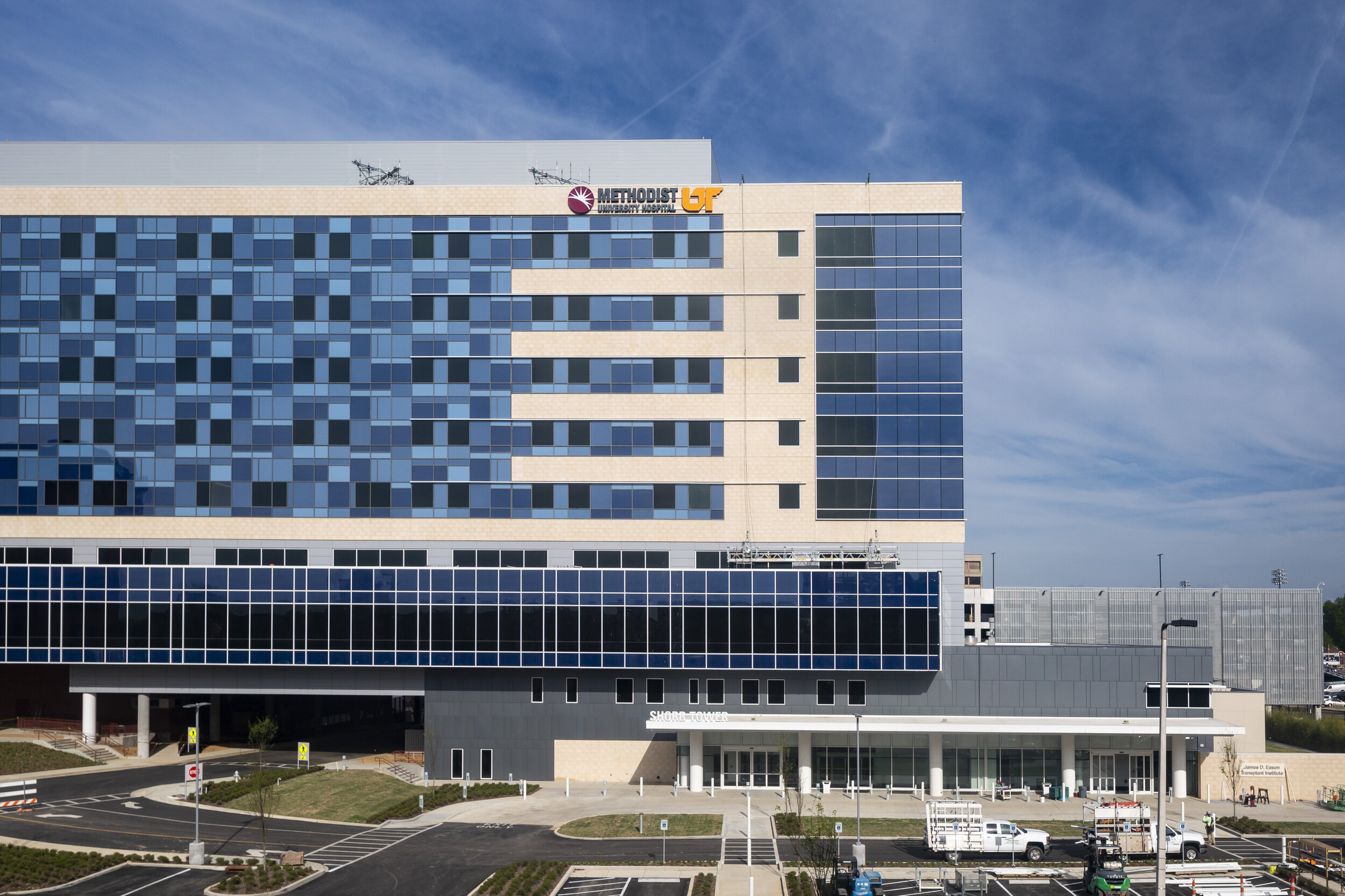
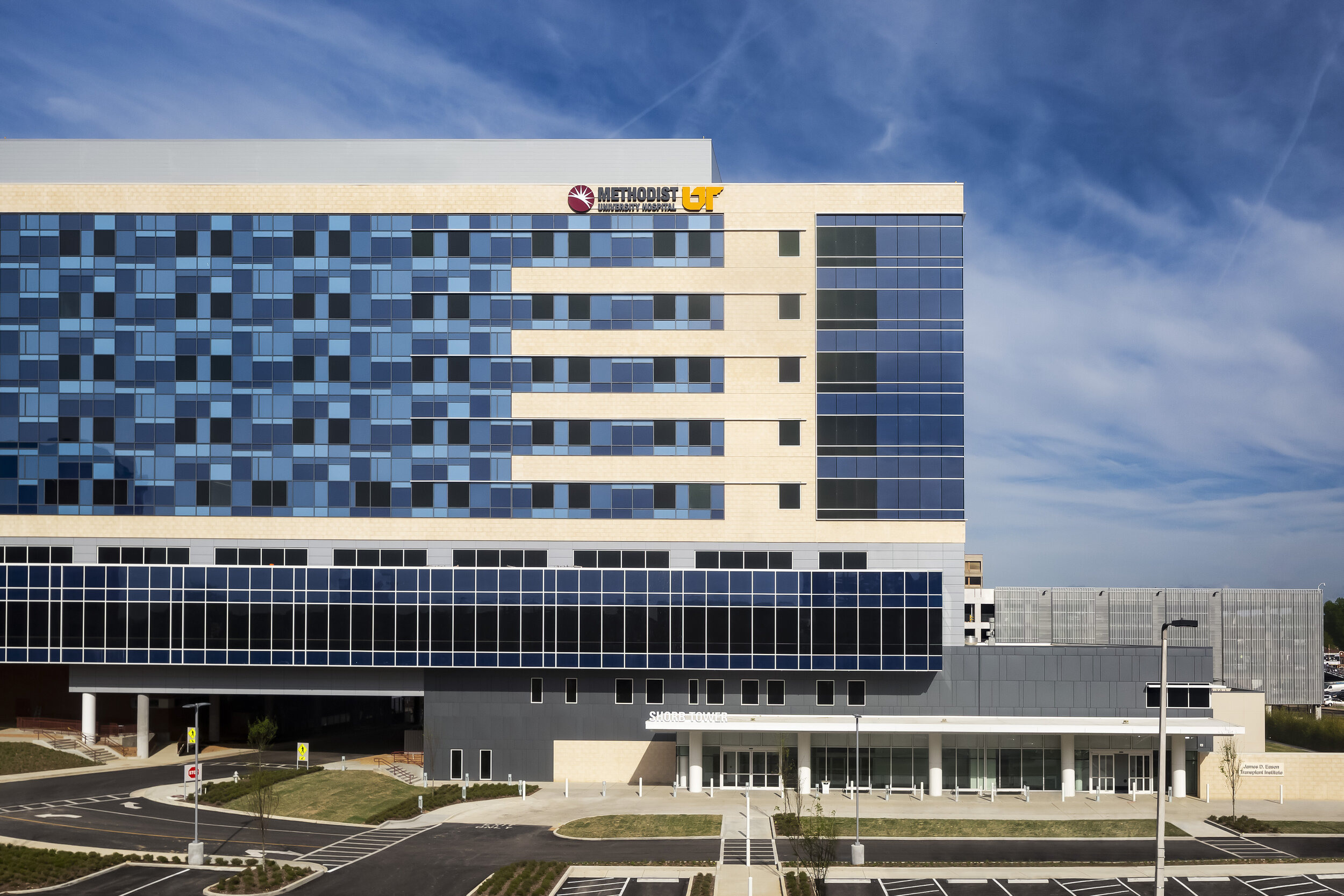
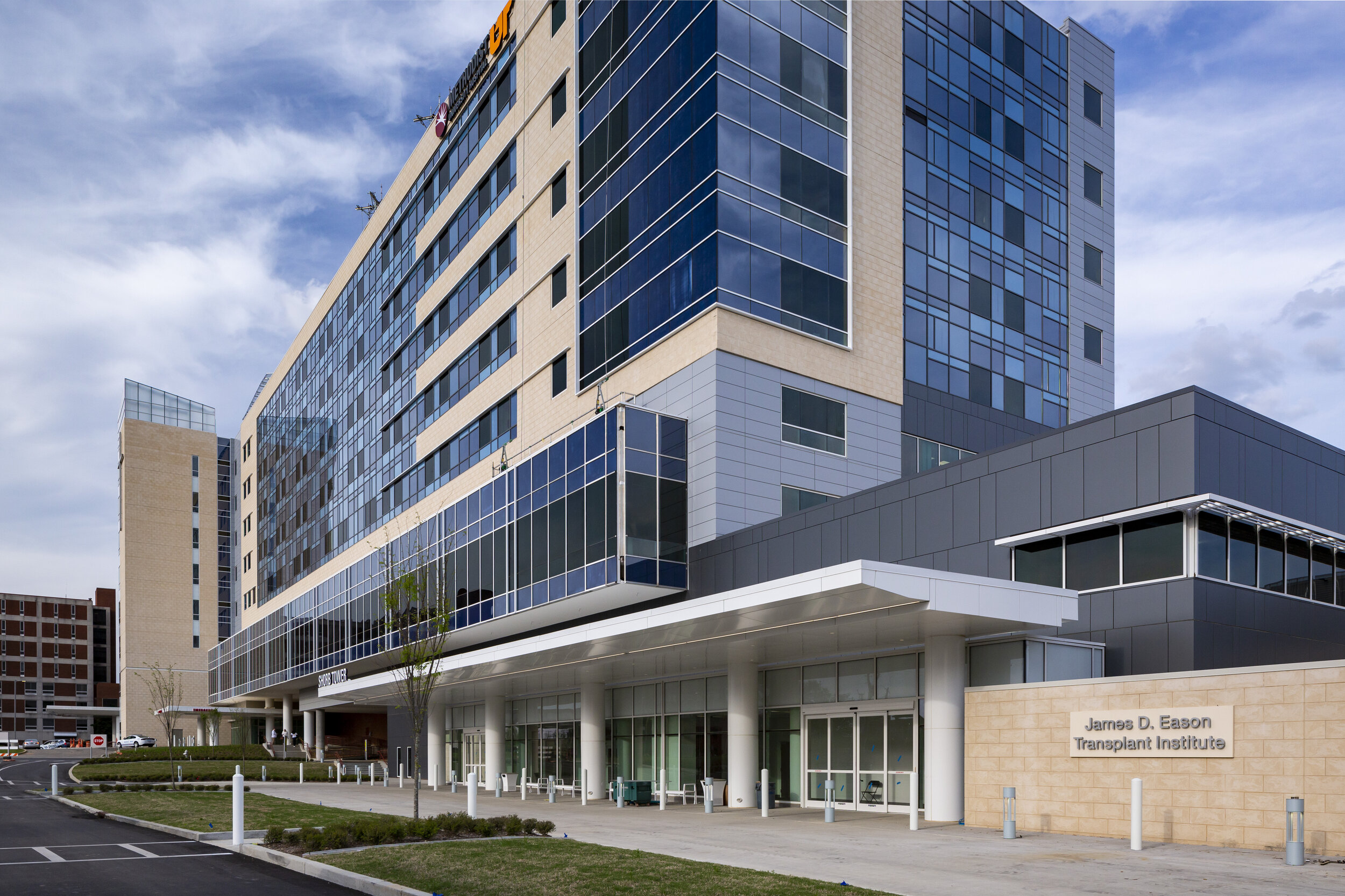
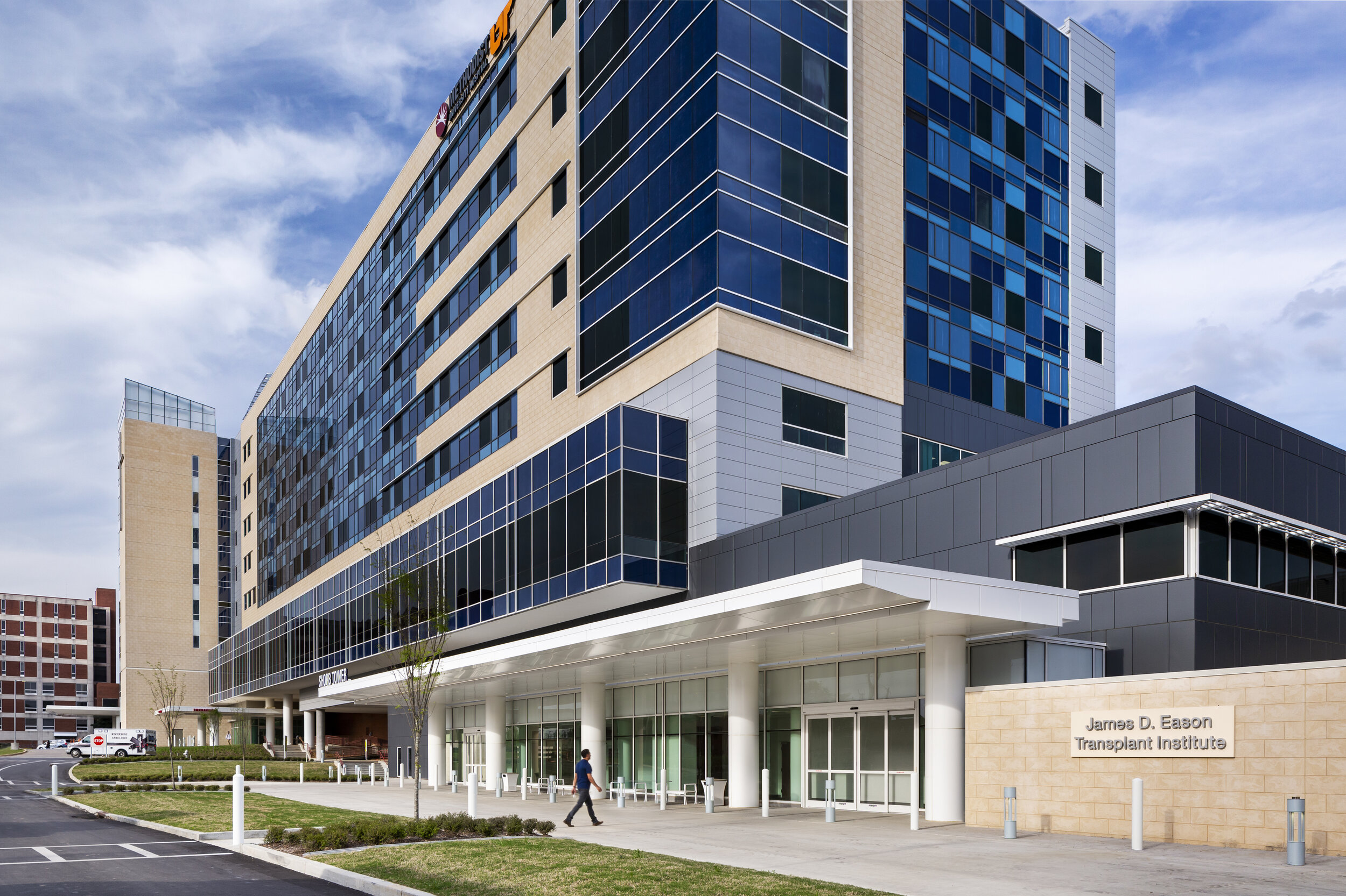
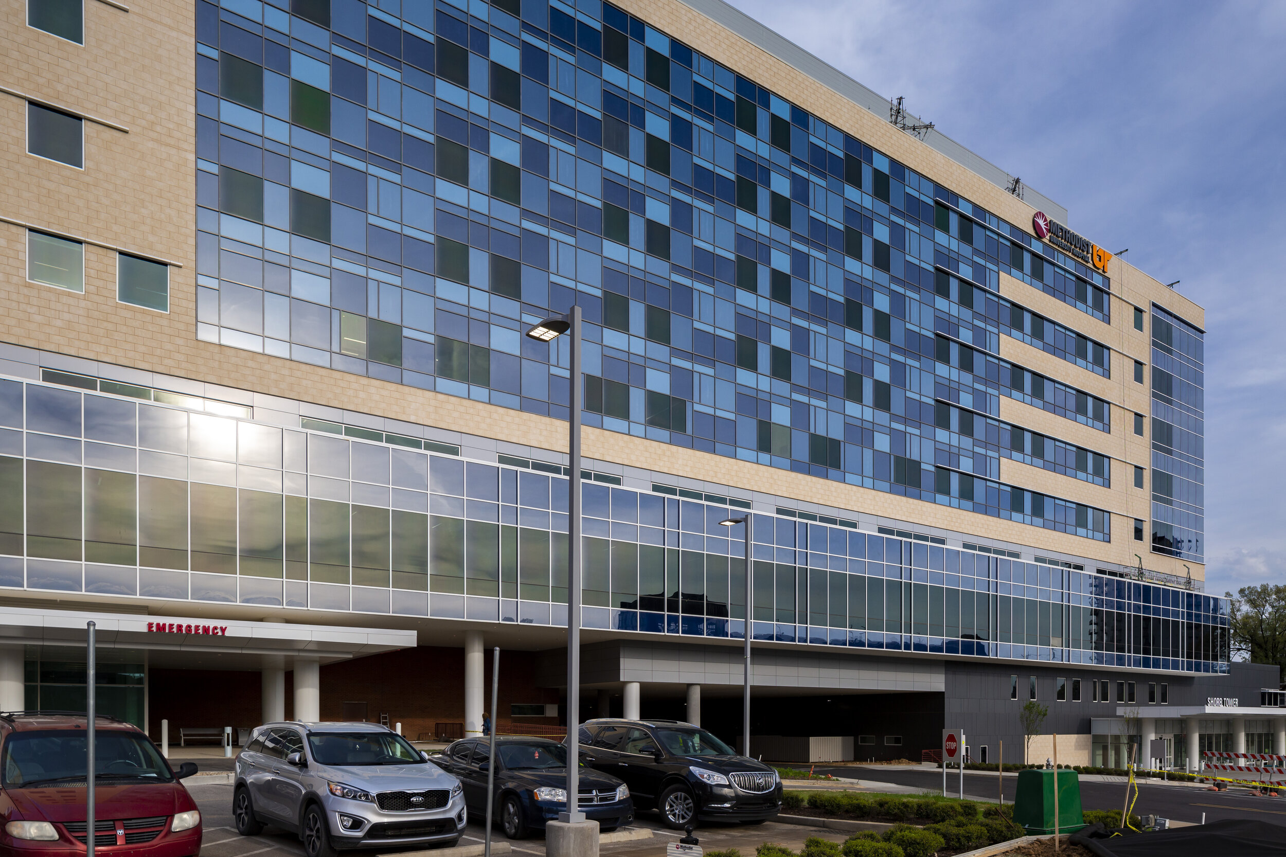
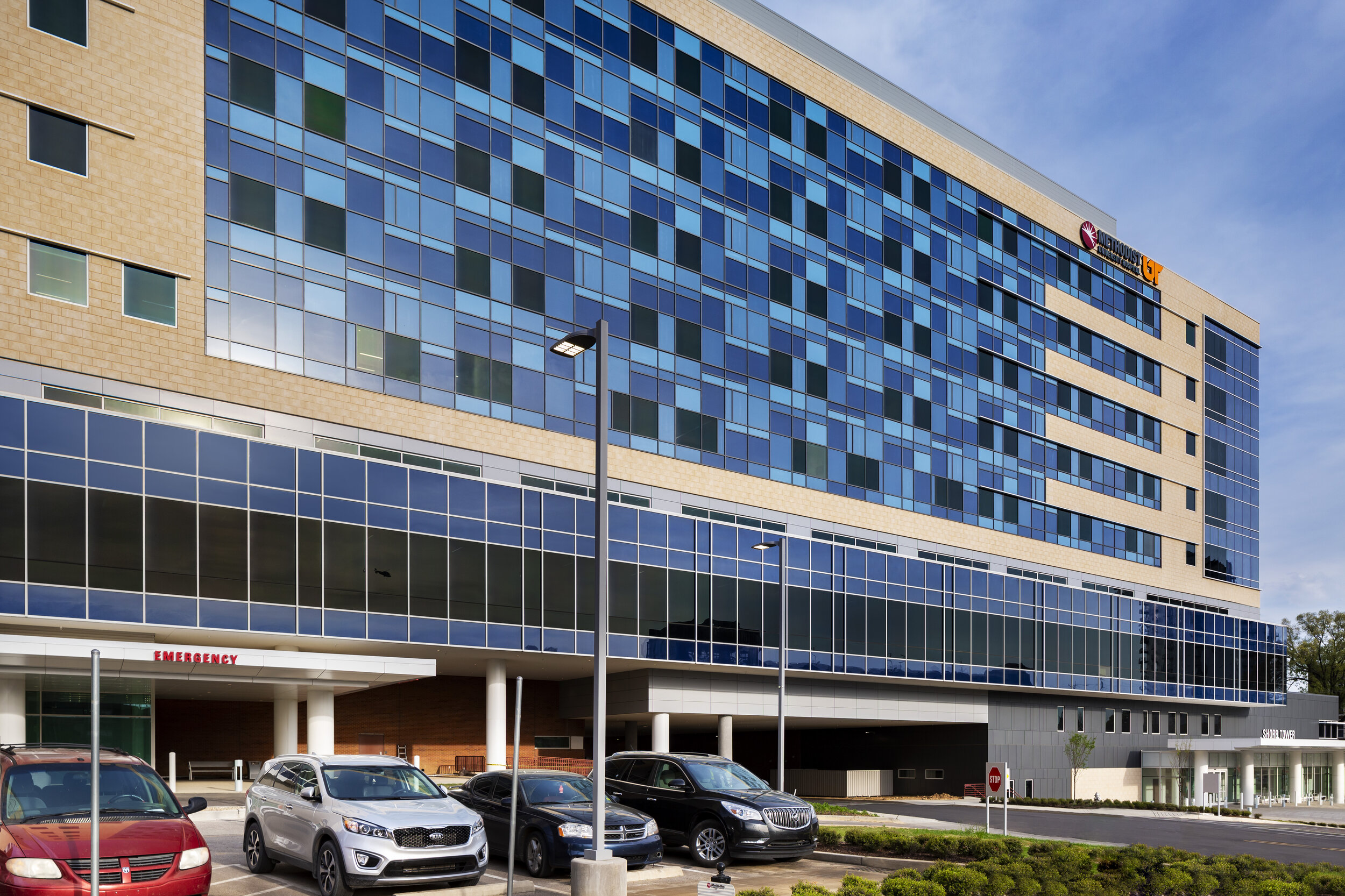
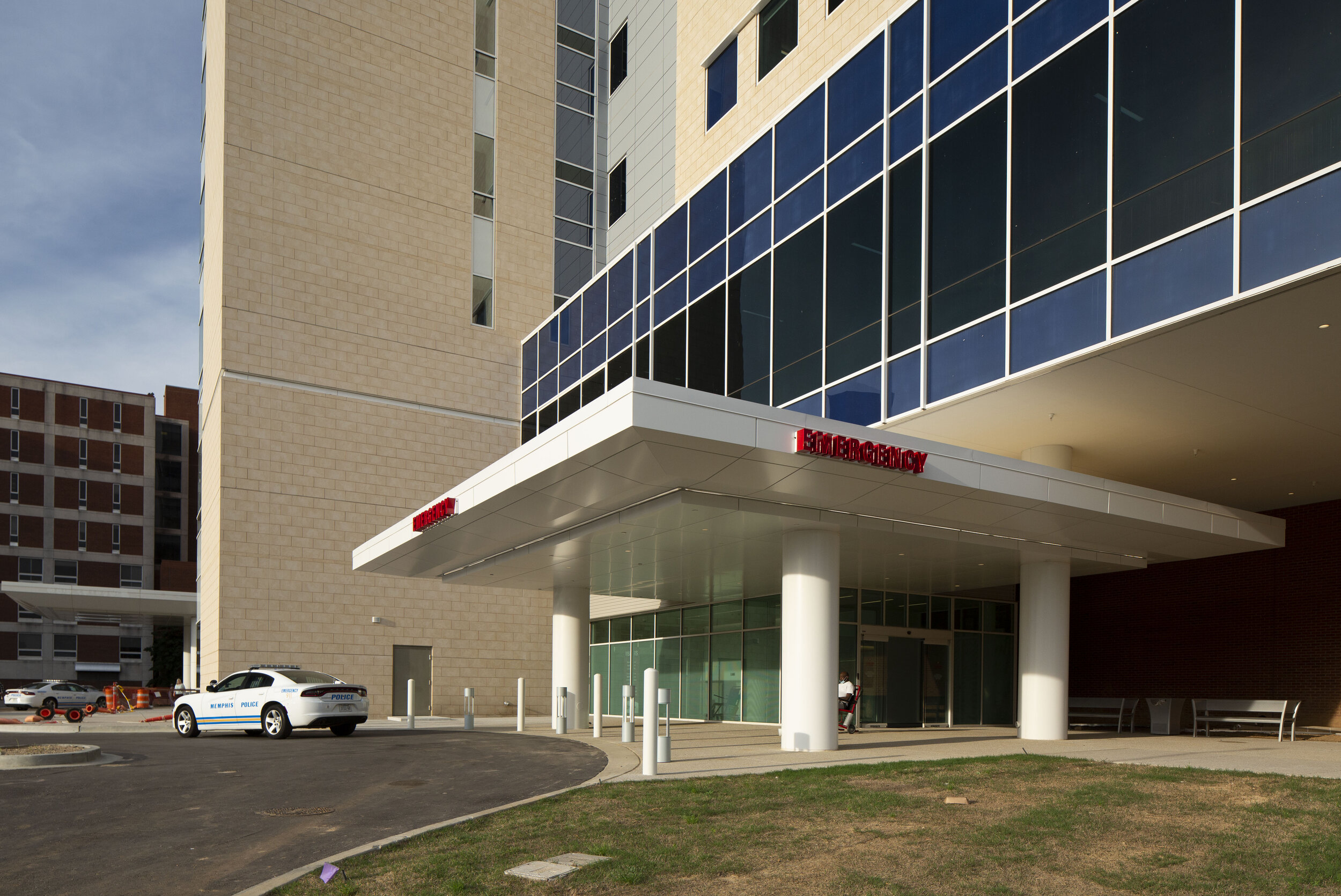
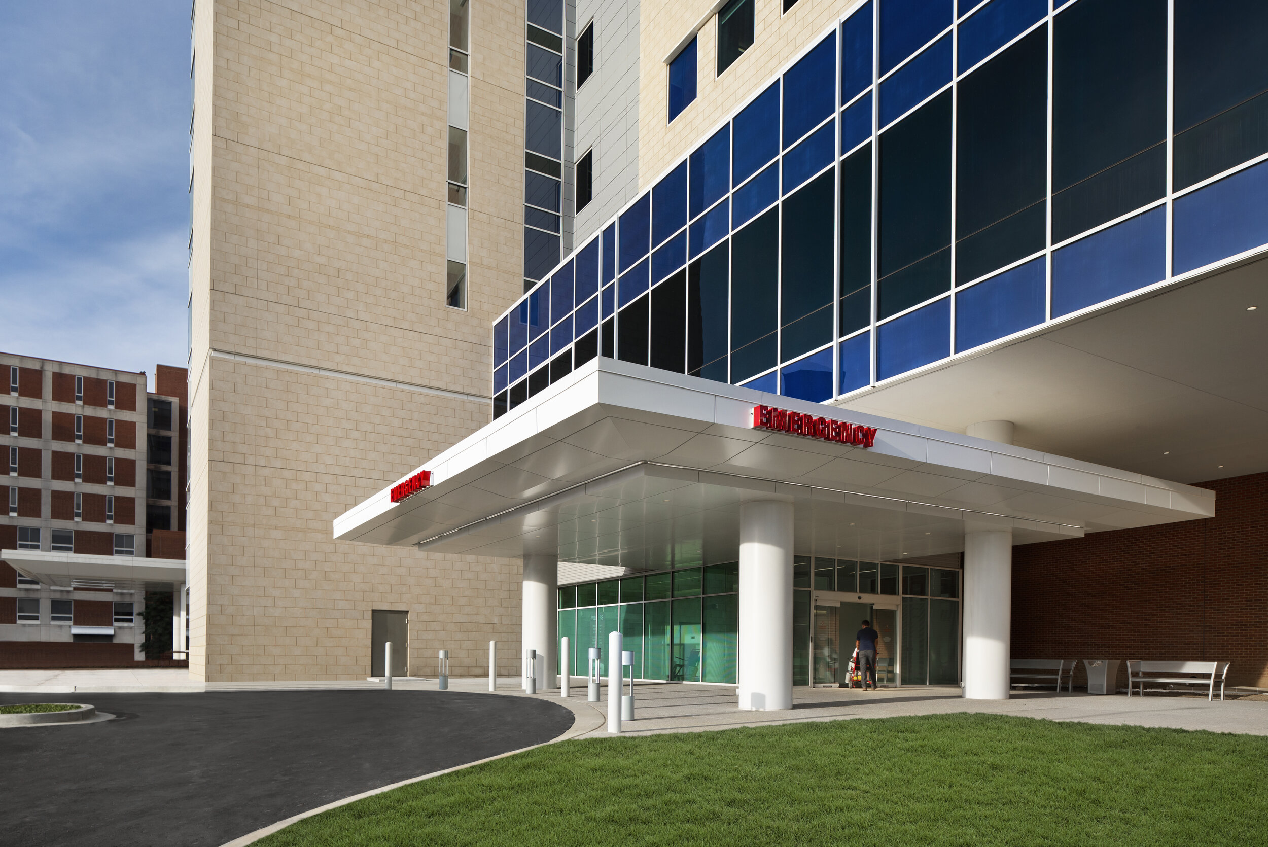
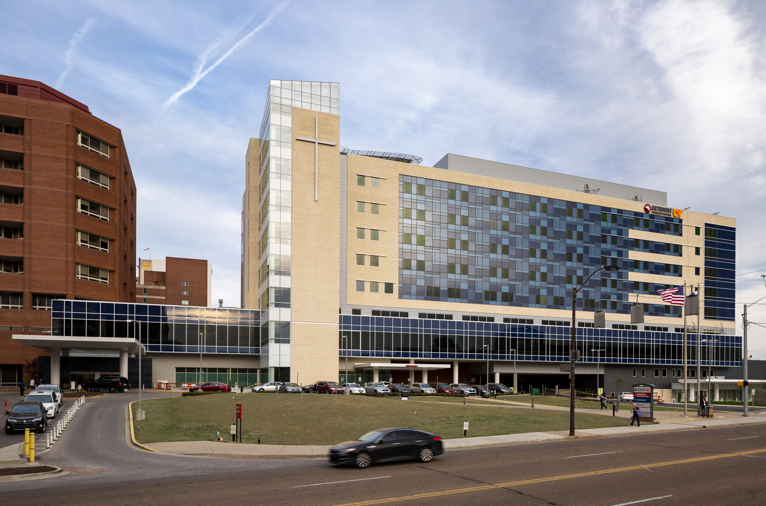
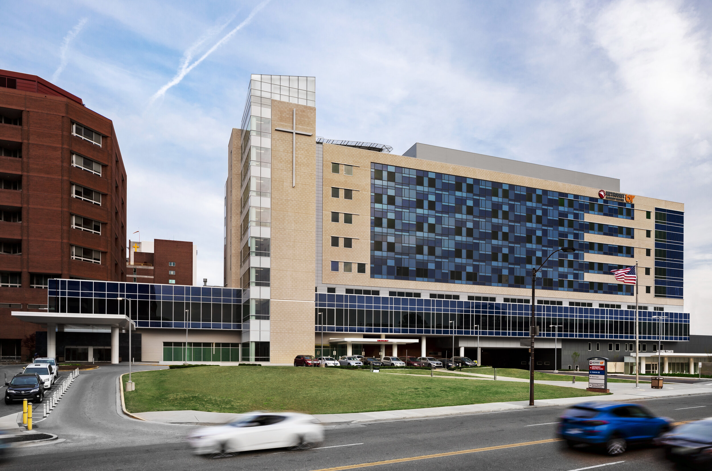
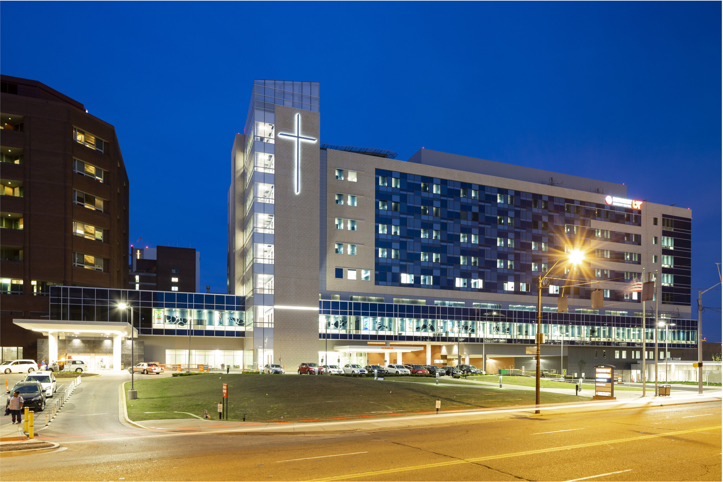
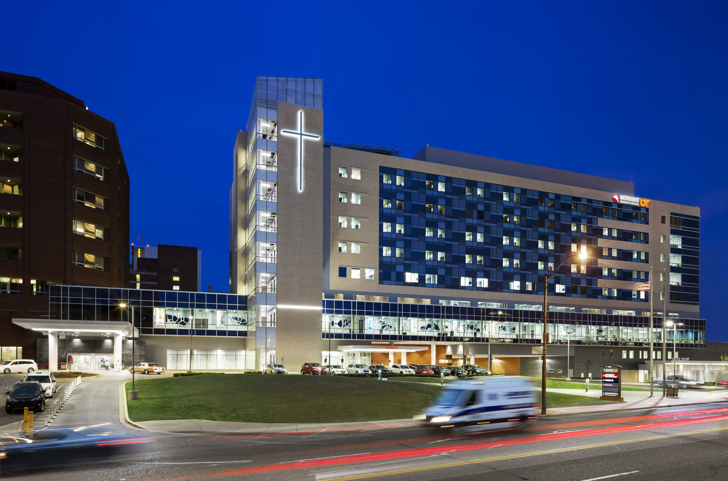
At the time of the shoot for Methodist Hospital, there was still a great deal of construction consequently leaving many exterior obstacles in front of the building that couldn’t be moved and workers with their trucks and gear everywhere. An extensive amount of retouching was done to remove these elements. Additionally, due to the type of glass on the building exterior and limitations on when we could shoot the exteriors, there was a giant sun glare that couldn’t be avoided as well. Cycle through the images below to see the dramatic changes. (Where’s Chris Harrison when you need him???…. “the most dramatic transformation yet!”)
Sometimes the weather doesn’t cooperate with our schedule. So in order to create the illusion of a sunny day, the sky was replaced with one from my sky library and each shadow was “painted” in by hand. Just like that, we can go from drab to fab!
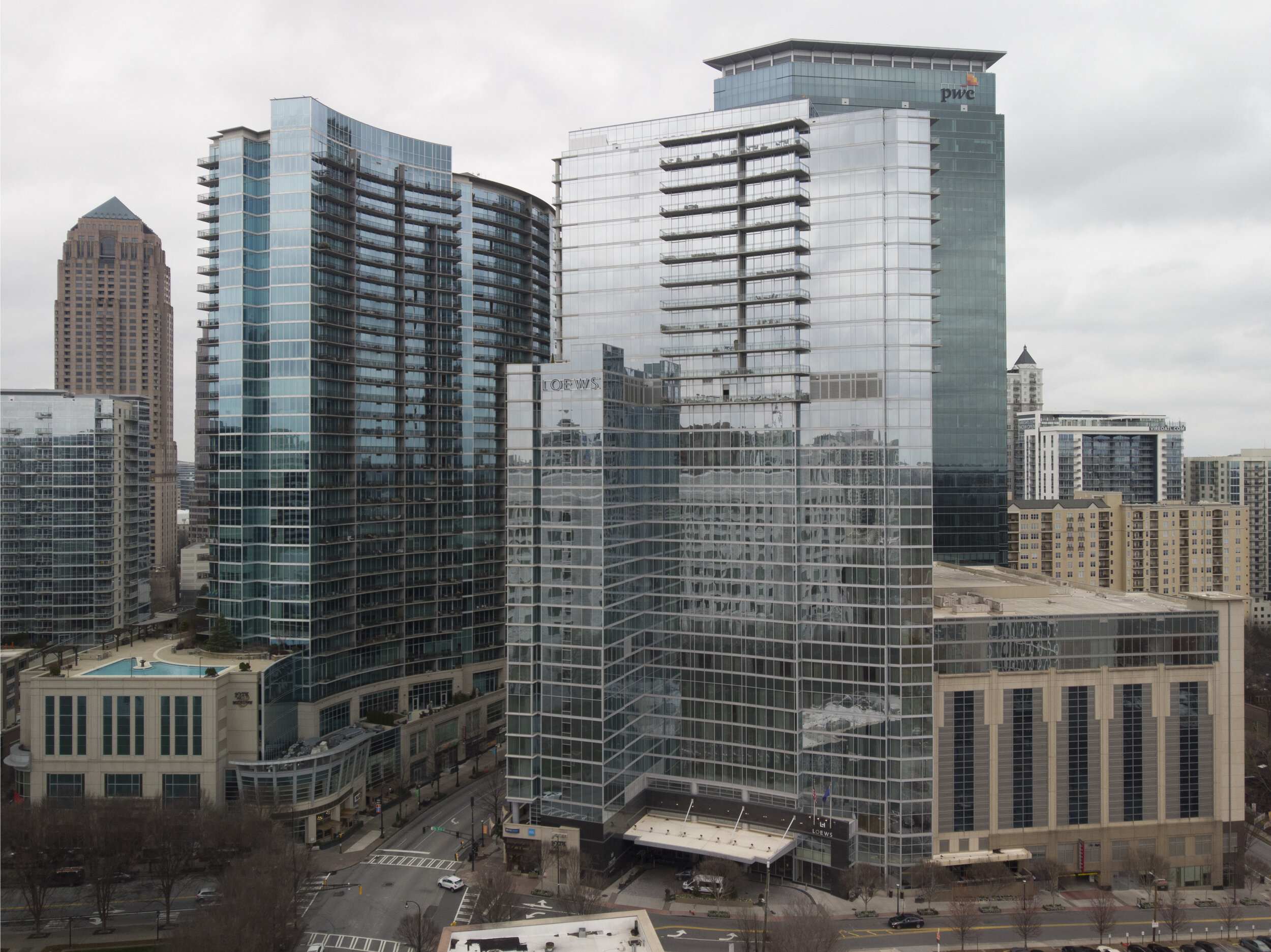
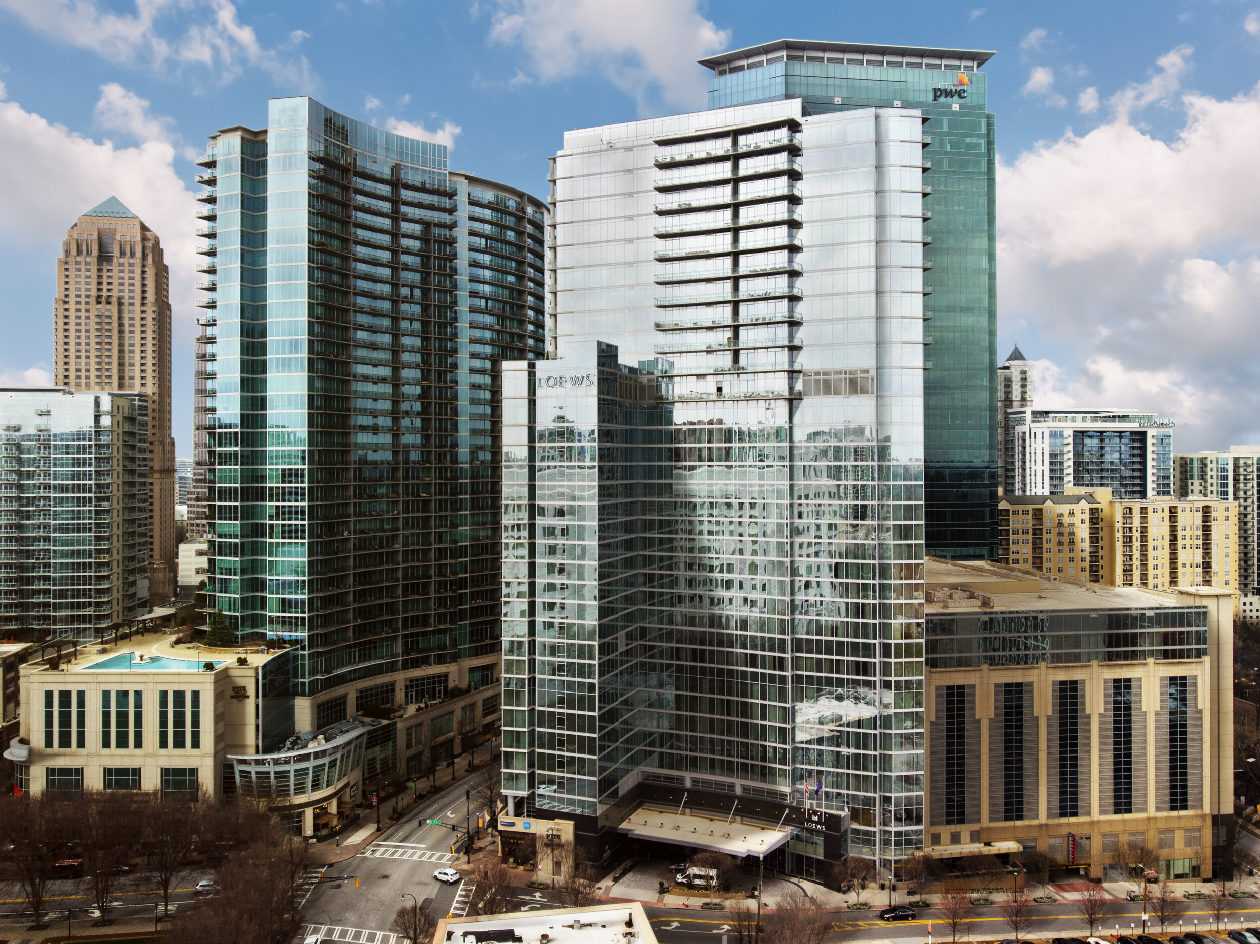
Below is an example of another sky replacement to add a little more drama to the image. Also, due to the limitations of where I could place the tripod to achieve the correct angle of the structure, there were many branches in the way. We provided a few final options to the client because leaving them can add some context and framing to the image but it can also distract the eye. Additionally, the vibe of the image changes drastically from dusk to blue hour, so we wanted to provide both of those options as well.
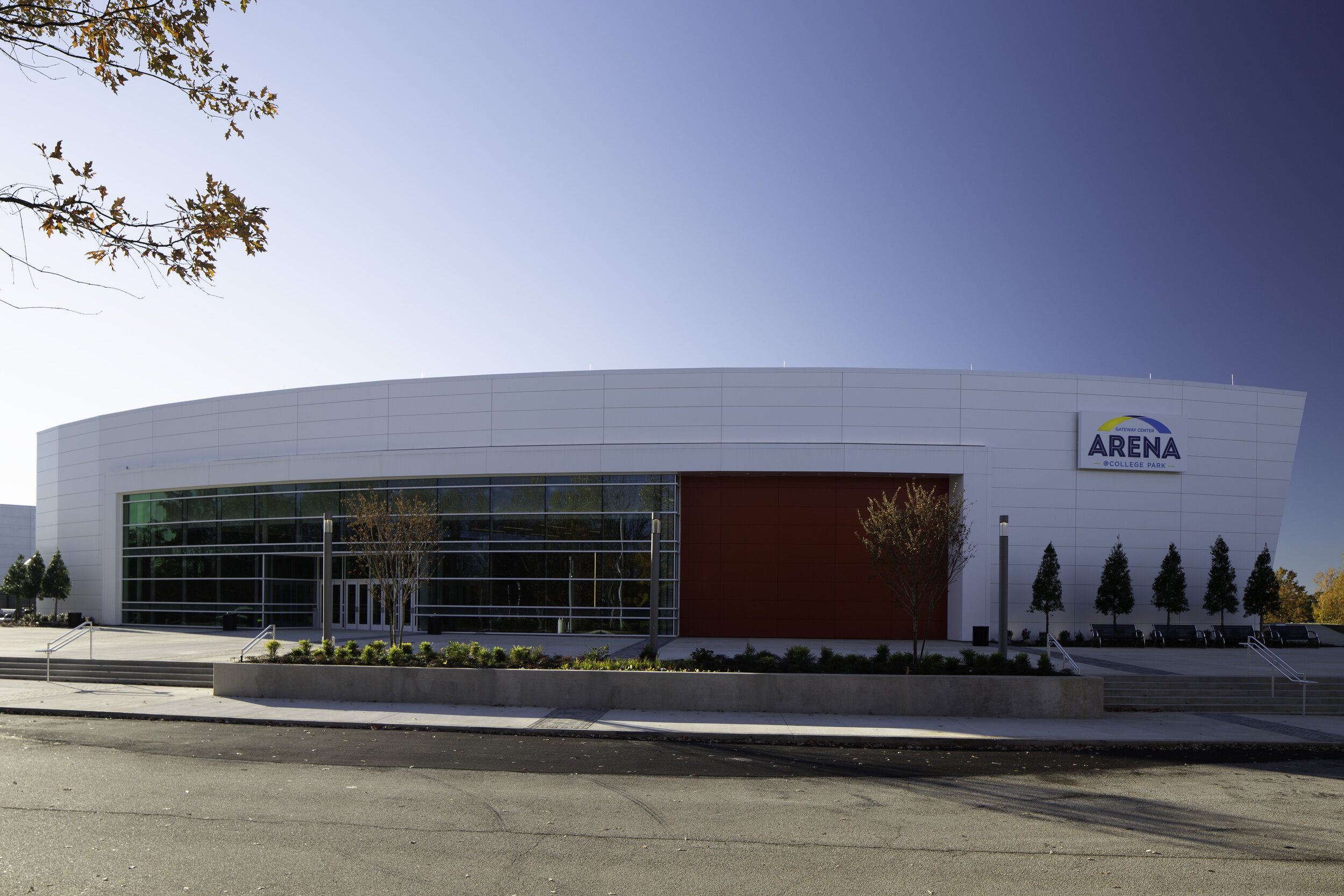
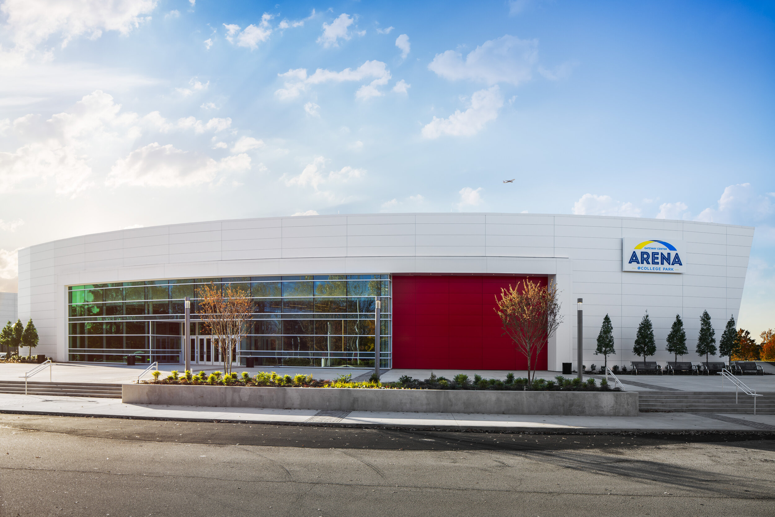


Here’s another image from the Gateway Arena project:
This is an example of MAJOR extensive editing. Consider this the Joan Rivers of retouching (RIP Joan!). After much debate on-site, the client and I determined that this was the best angle to accurately showcase the entire structure despite the light pole being dead center of the view. The cars also didn’t budge all day and since this was a college campus, we had no way to track down the owners to ask them to move. Therefore, I also had to position my tripod on the roof of my car to get high enough to clear the cars. I assured my client that I could work my magic so I summoned the Photoshop Gods and knocked this edit out. It took almost TWO full days to complete.
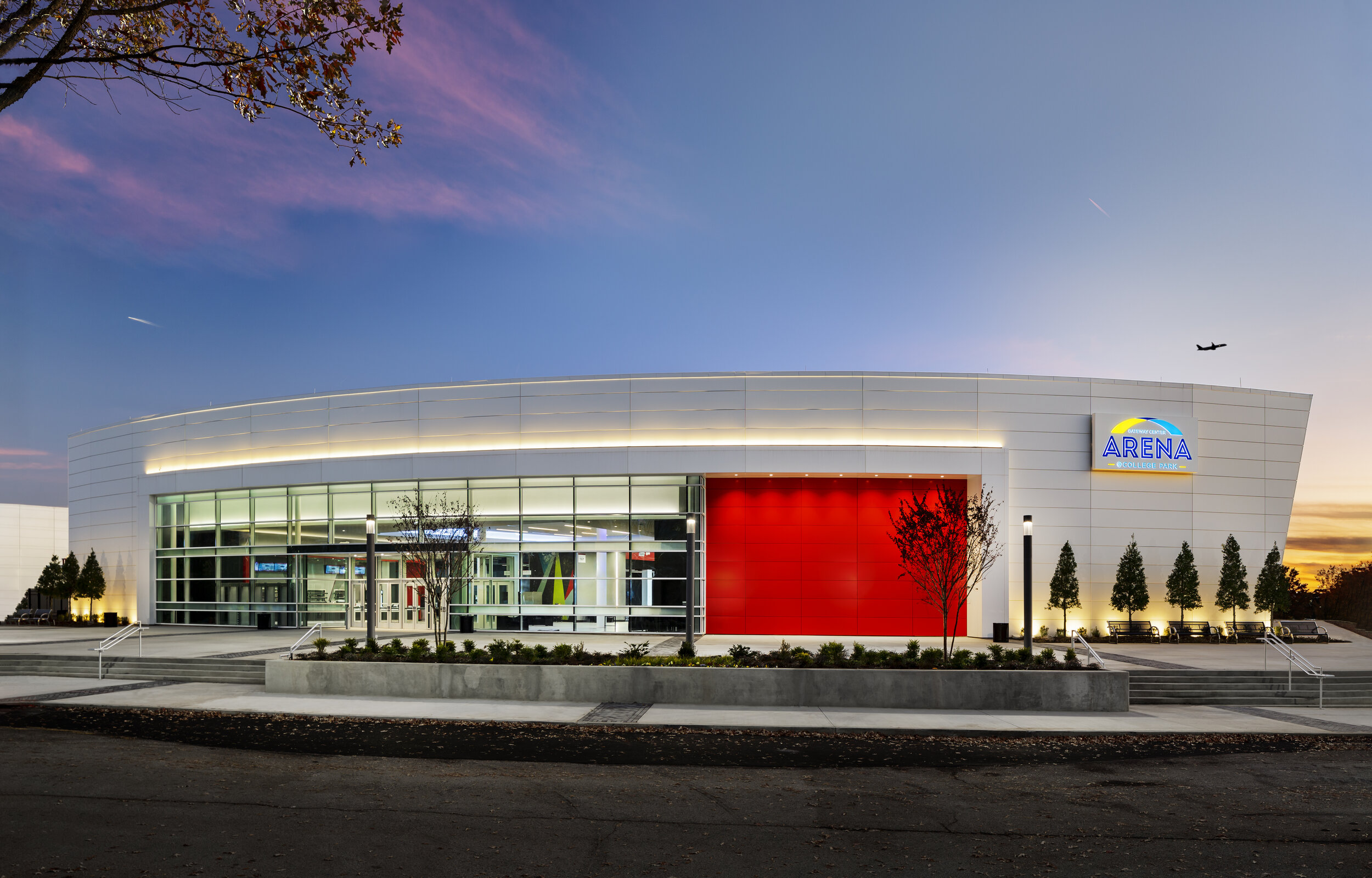
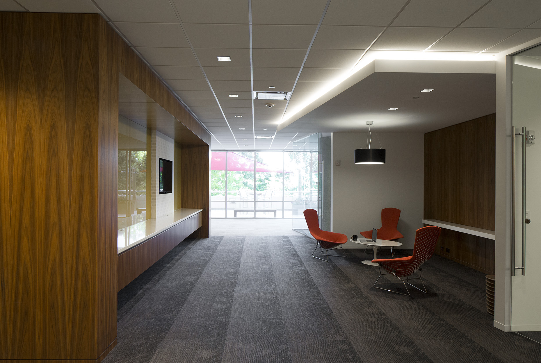
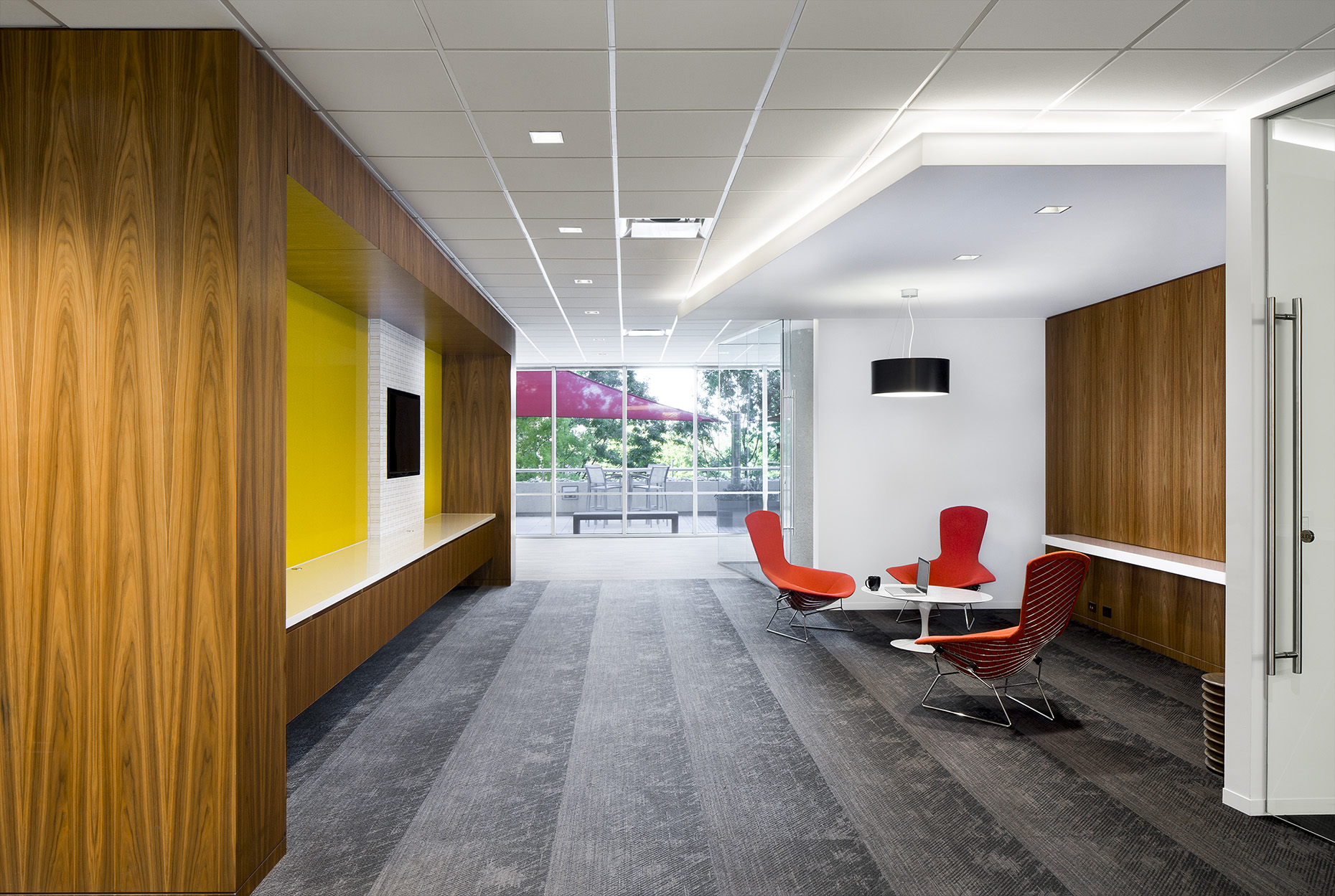
This one is from the same project as above, but not QUITE as an intense transformation. However, here you can see how much a difference it makes to remove phone poles, wires, signage, and other distracting elements. This helps the eye only focus on the star of the show: the building.
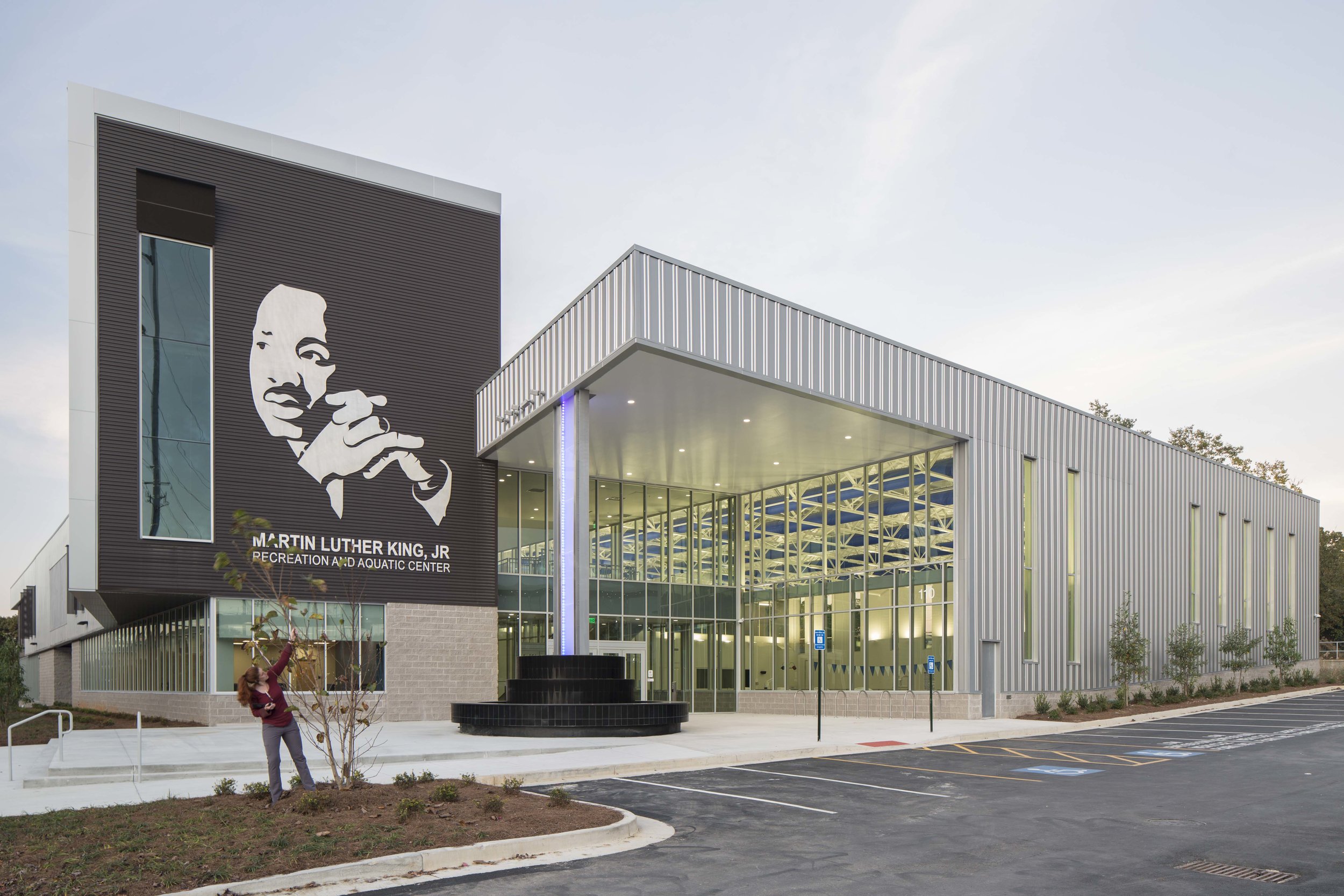
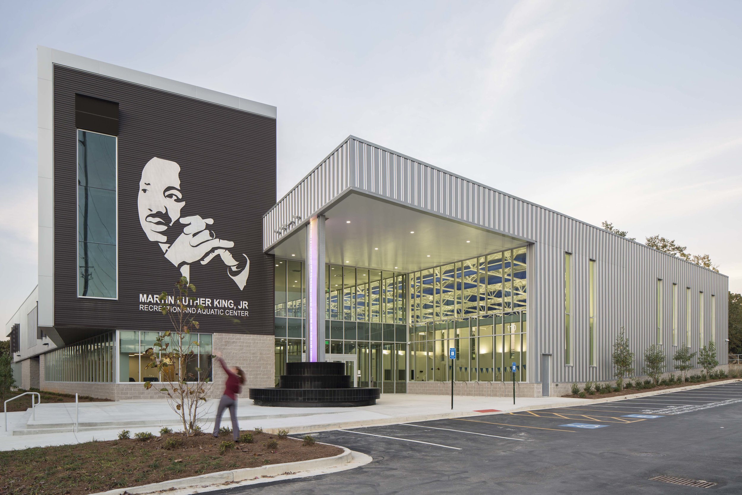
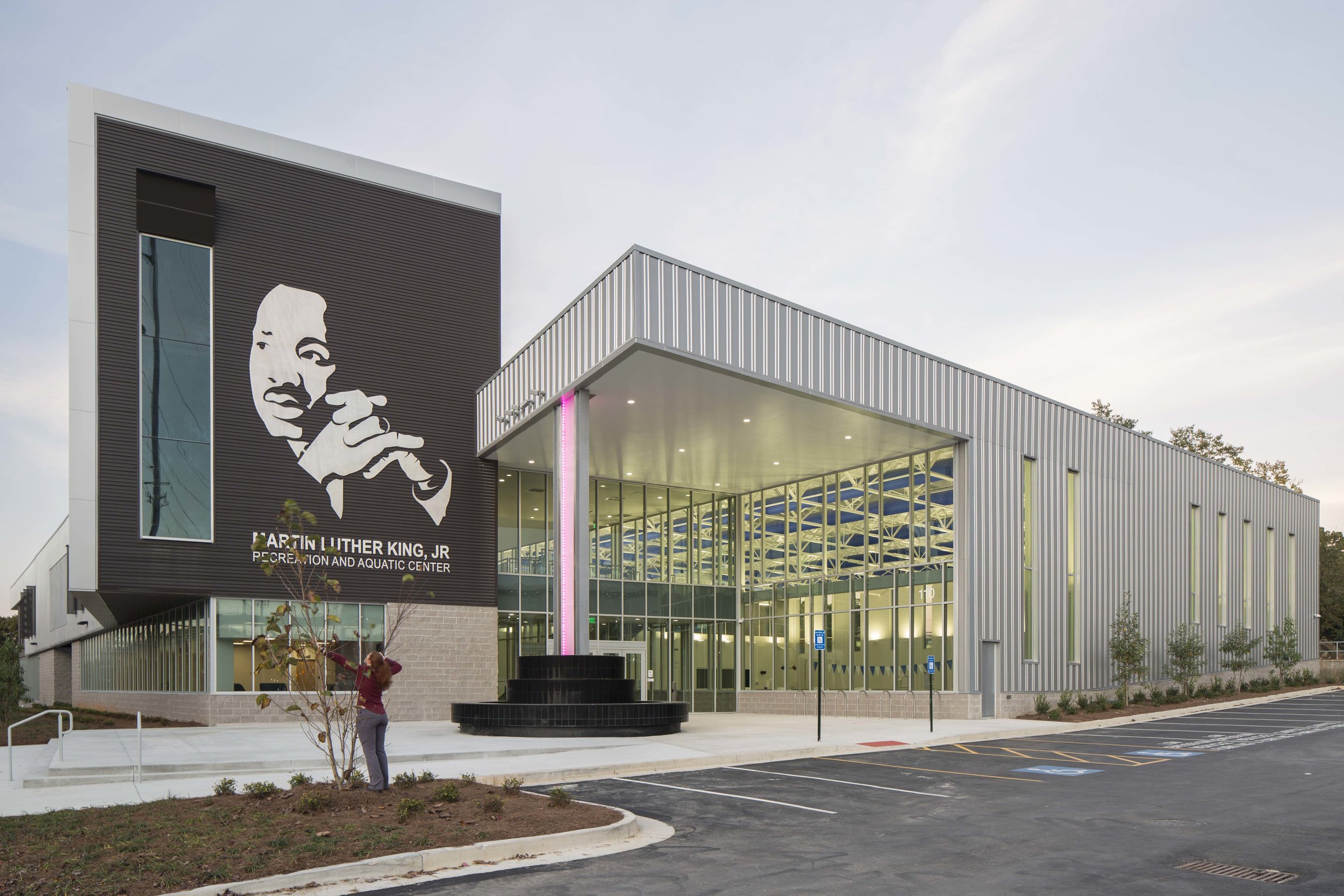
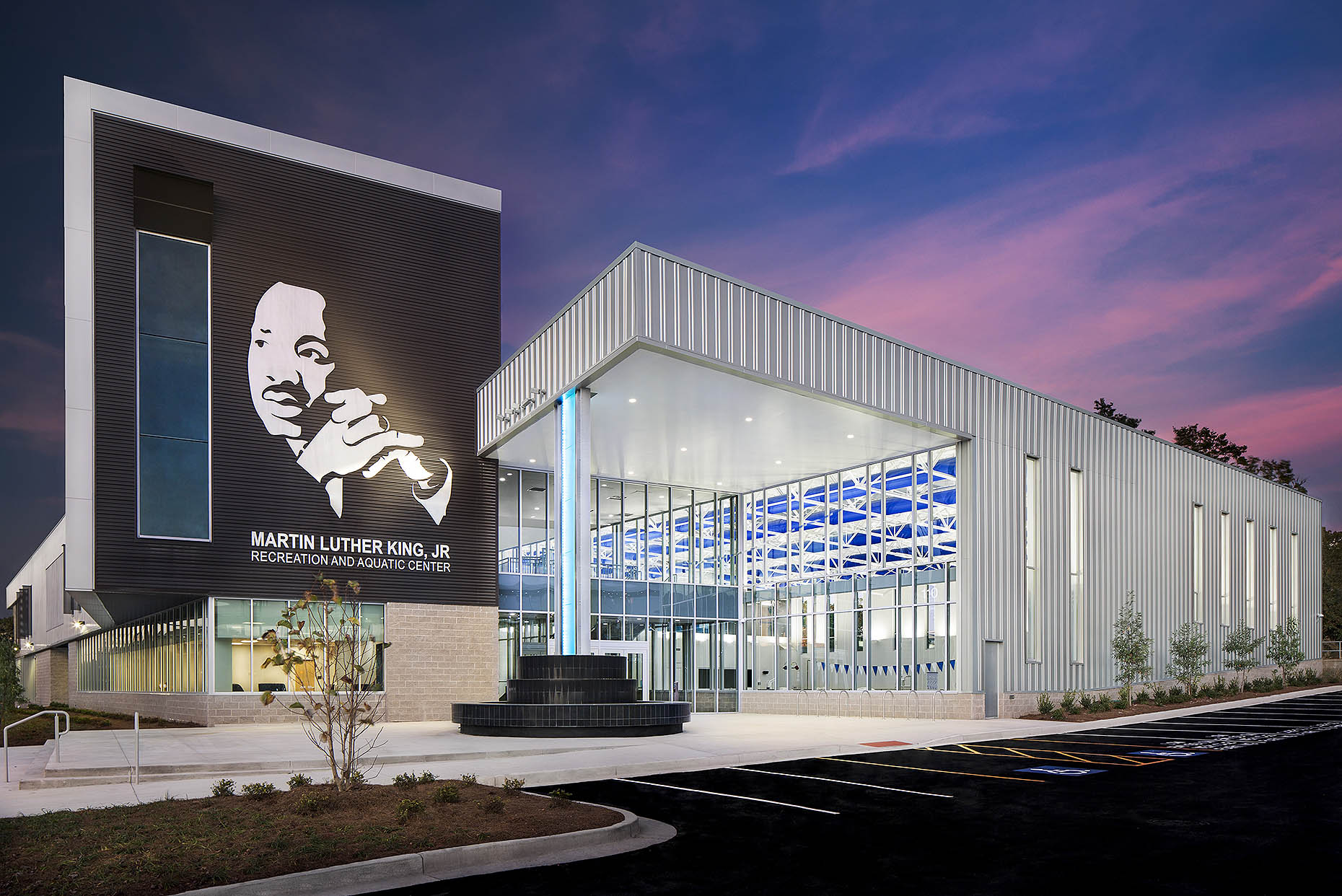
Here we have the twilight shot of the brand new beautiful MLK Center in all its glory, but the new baby tree was blocking the signage. I obviously couldn't trim it, and I couldn't position my camera any further to the left or right because you would have seen ugly power poles. Therefore, the only solution was to *gently* bend the branches so that each section of the lettering had a clear view to the camera. Then I just blended them in post. Also, there was a lot of parking lot clean up and handicap signs removed as well. This edit took one whole day. Literally. (And believe it or not, that cotton candy sky coloring was completely real--I just bumped up the contrast and saturation a little. )
Notice the heavy glare on the yellow wall...my polarizer filter is usually a magic worker when it comes to eliminating reflections, but it was no match for this monster glare. This had to be corrected during the shoot by placing tall black cloths in front of the windows to block the glare yet still showcase the texture and color of the wall.
(Interior Design © IA - Interior Architects 2016)
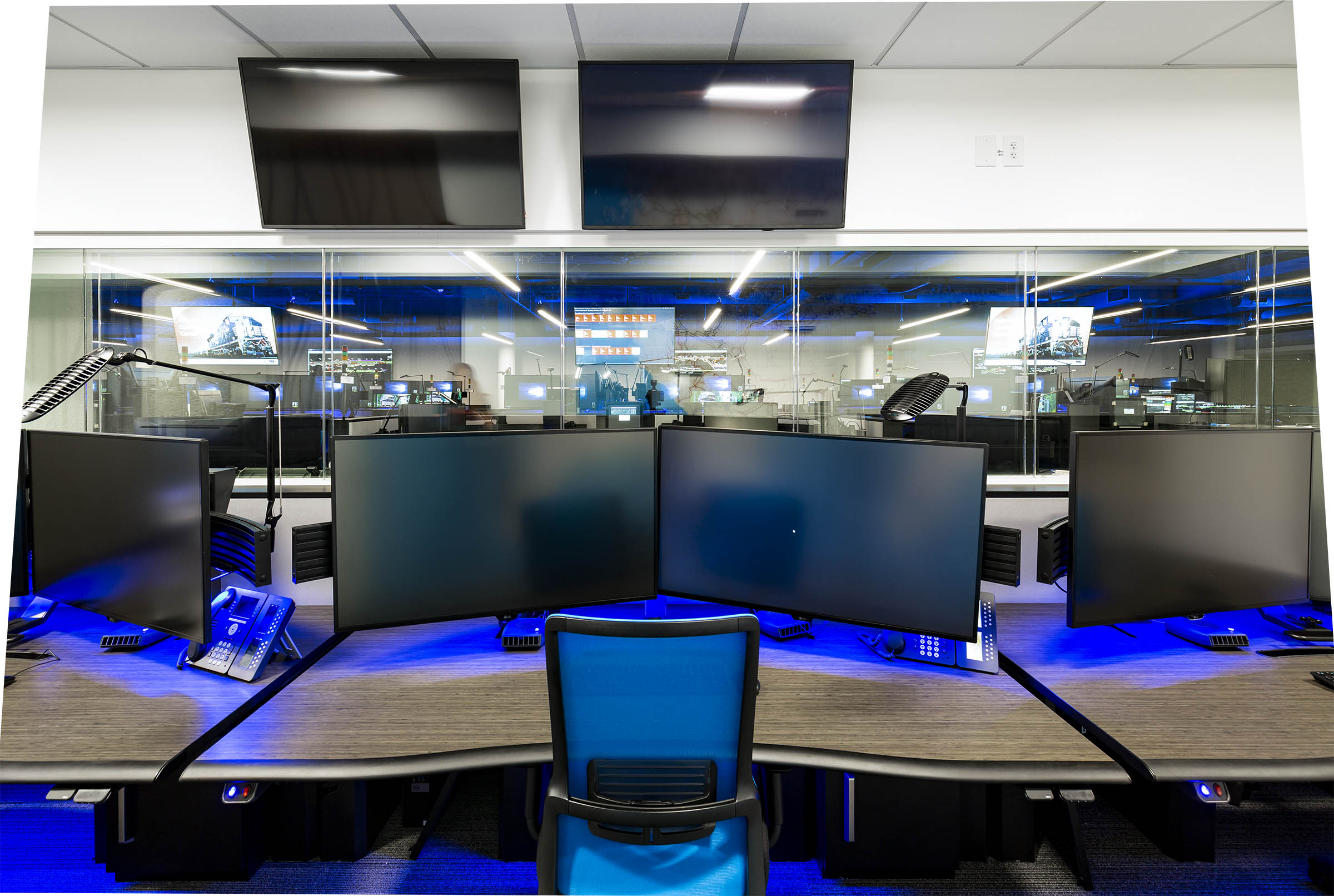
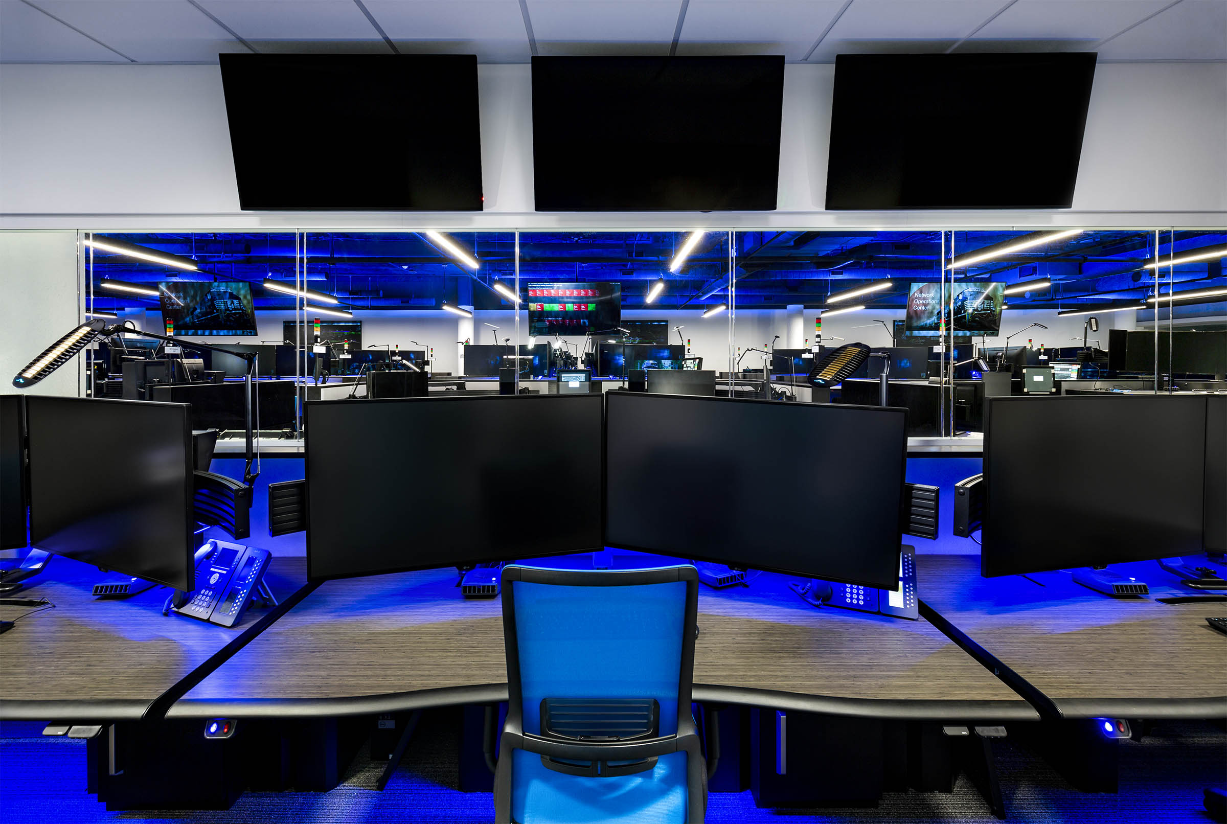
This image has many elements that needed a lot of TLC. First, there were obviously a ton of reflections to deal with during the shoot, so many exposures were taken with all the lights off and blended in so you could see through to the open area outside the control room. Secondly, one of the TV’s was missing so I duplicated the far left one and skewed the perspective to make it look as natural as possible. Finally, this was a very tight space and this was as far as I could position my tripod back and used my widest lens, but when I corrected the overall perspective, it cut off some of the sides. Therefore, I had to rebuild some of the edges to preserve overall feel and size of the room.
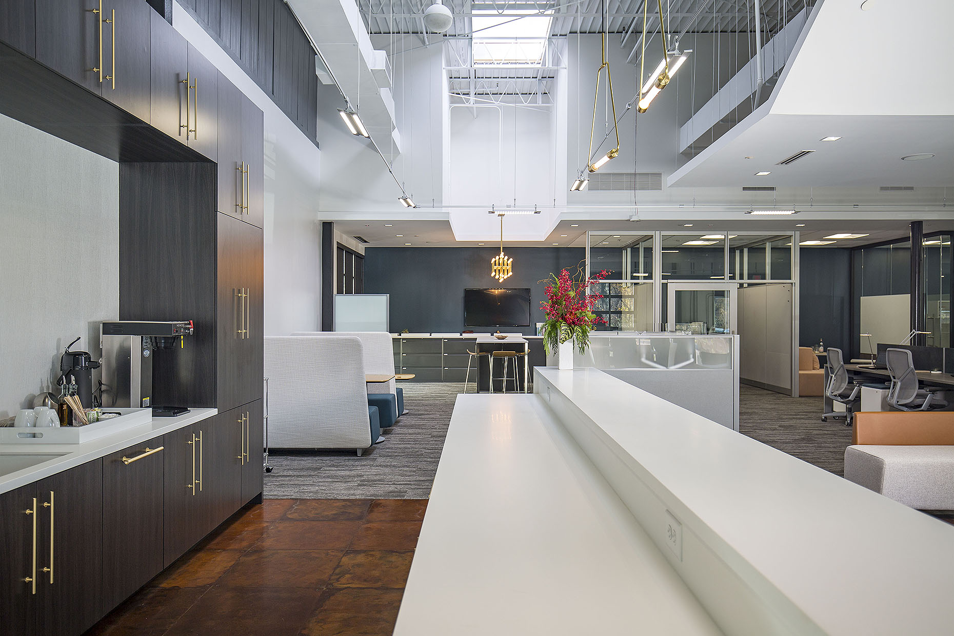
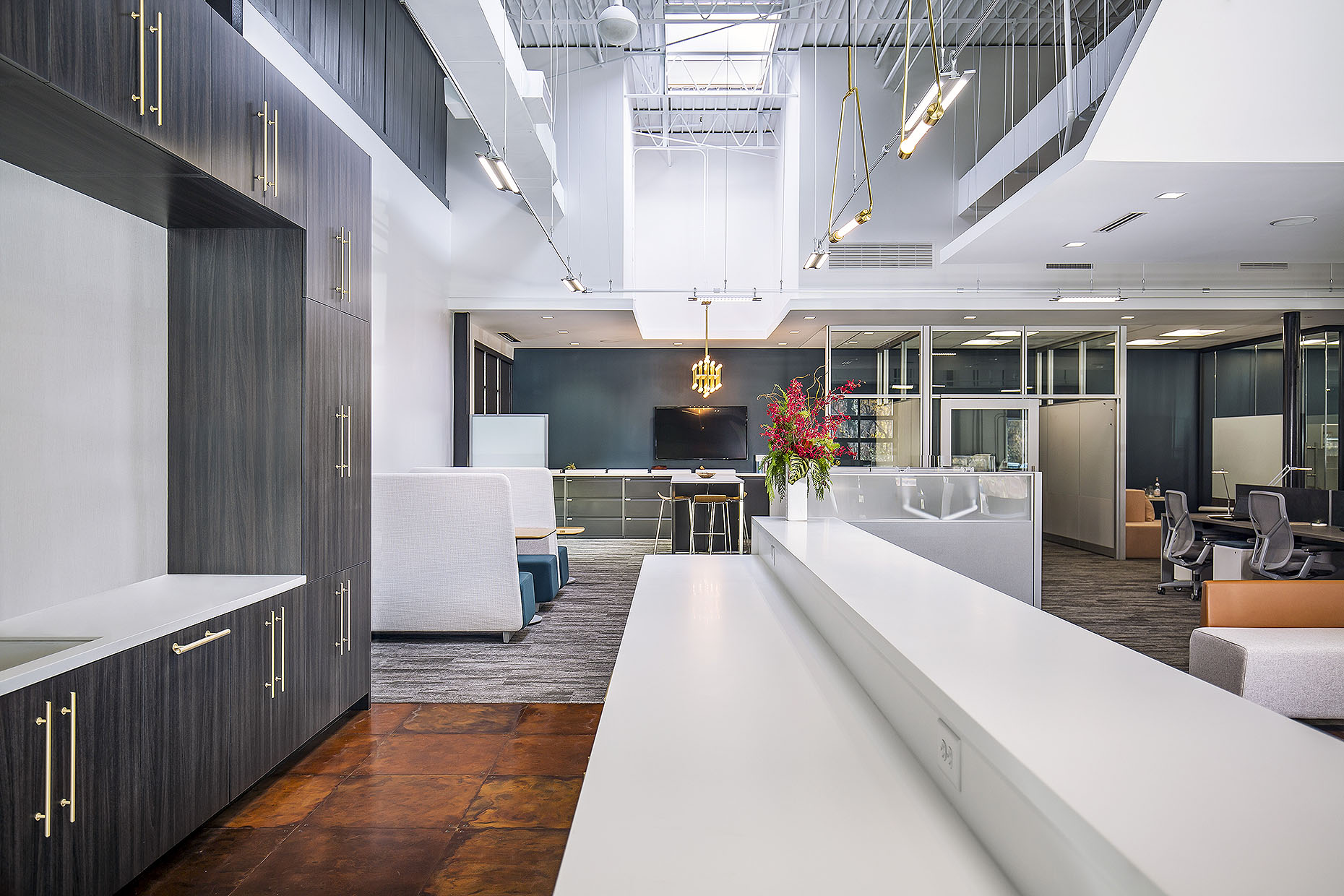
This is a perfect example of when the decision to remove an item comes after the shoot is over. Obviously it would have been easier to move the coffee station off the counter during the shoot, but it was actually removed in post-production per the architect's request.
This is an example of when pesky furniture pieces cannot be moved during the shoot and must be taken out in post-production where I had to completely reconstruct the bottom right corner.
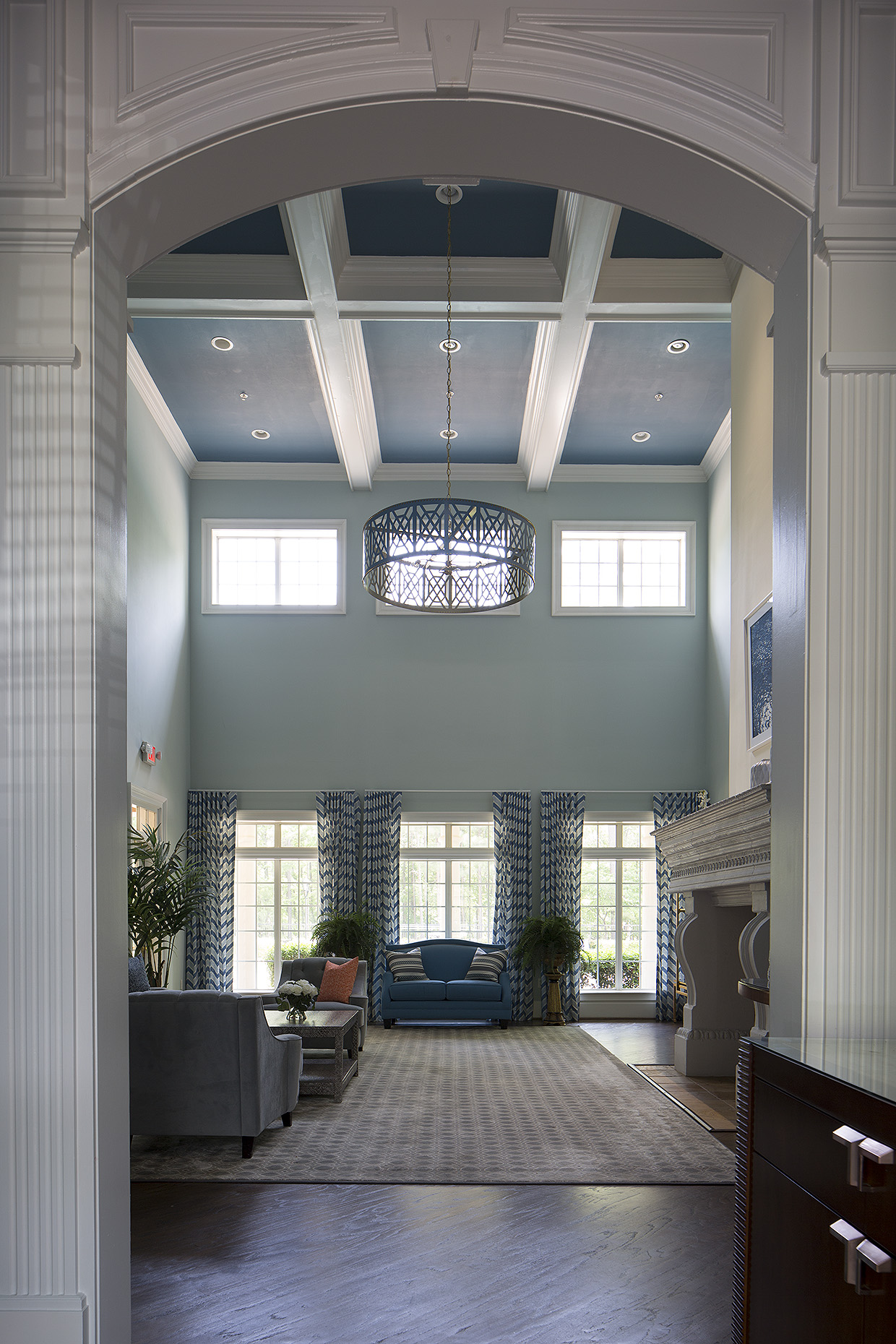
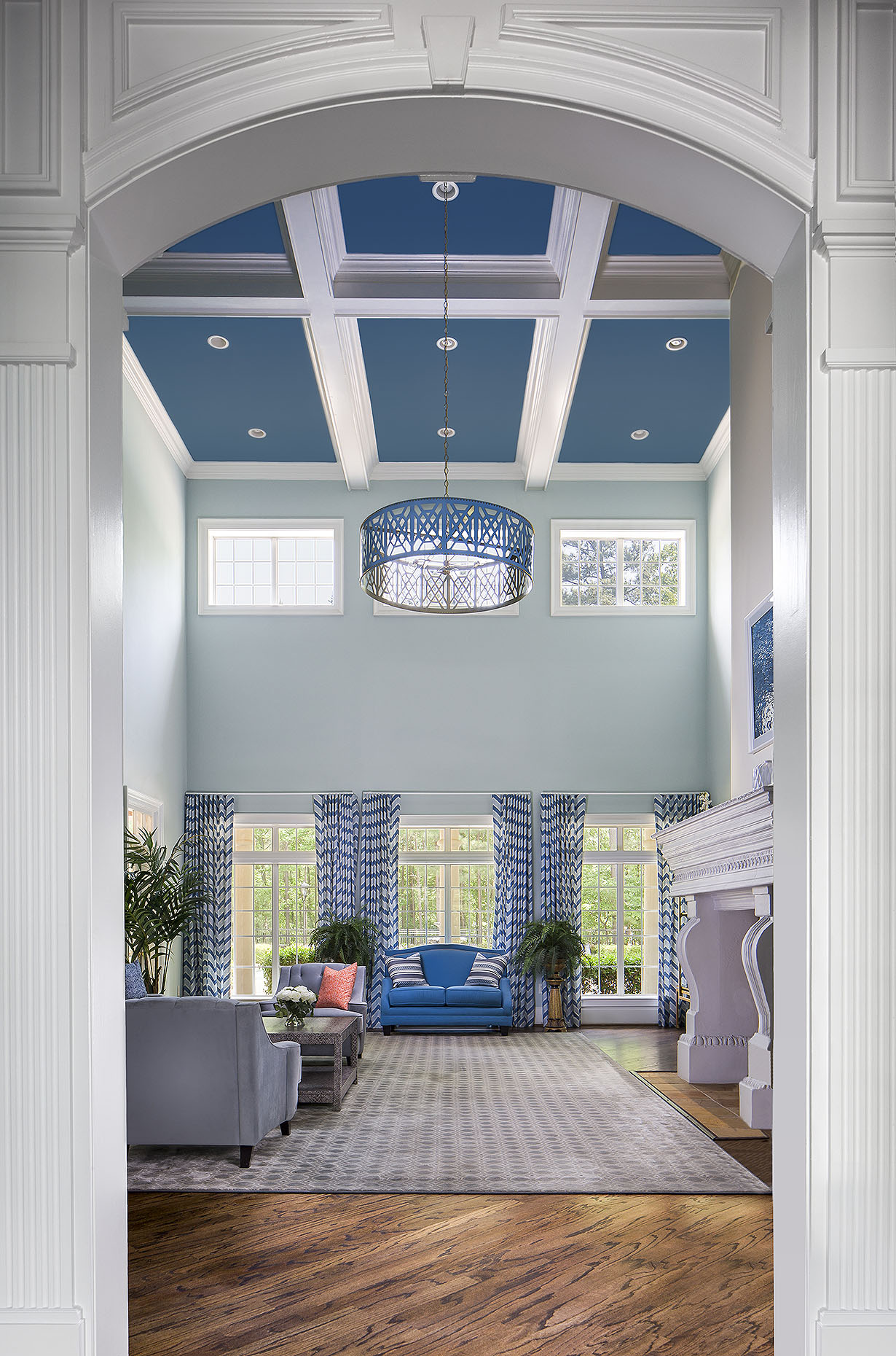
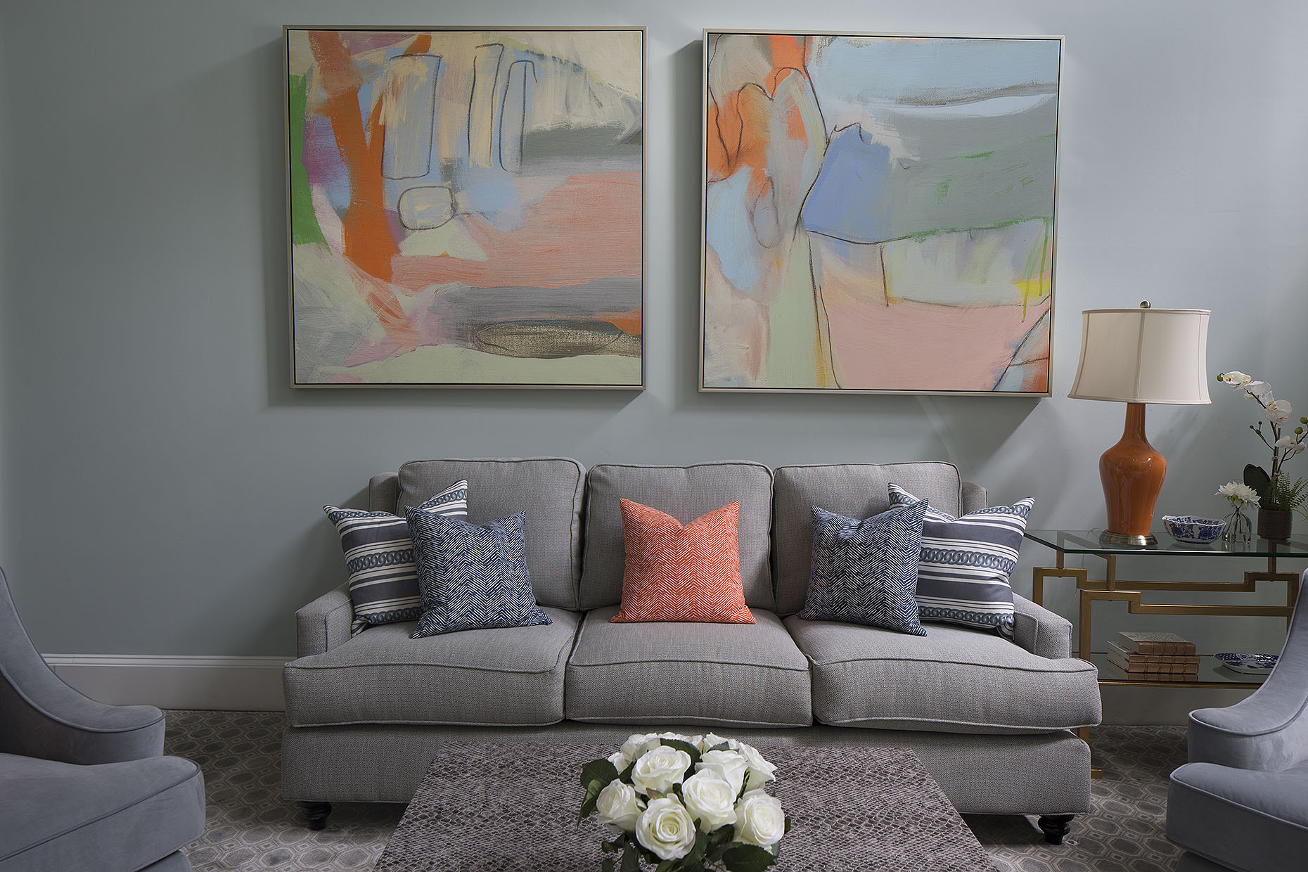
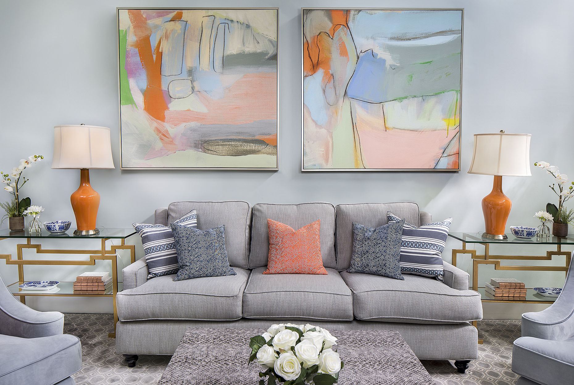
This is a simple example of natural ambient light versus the use of supplemental lighting. Both are nice. What's your style?
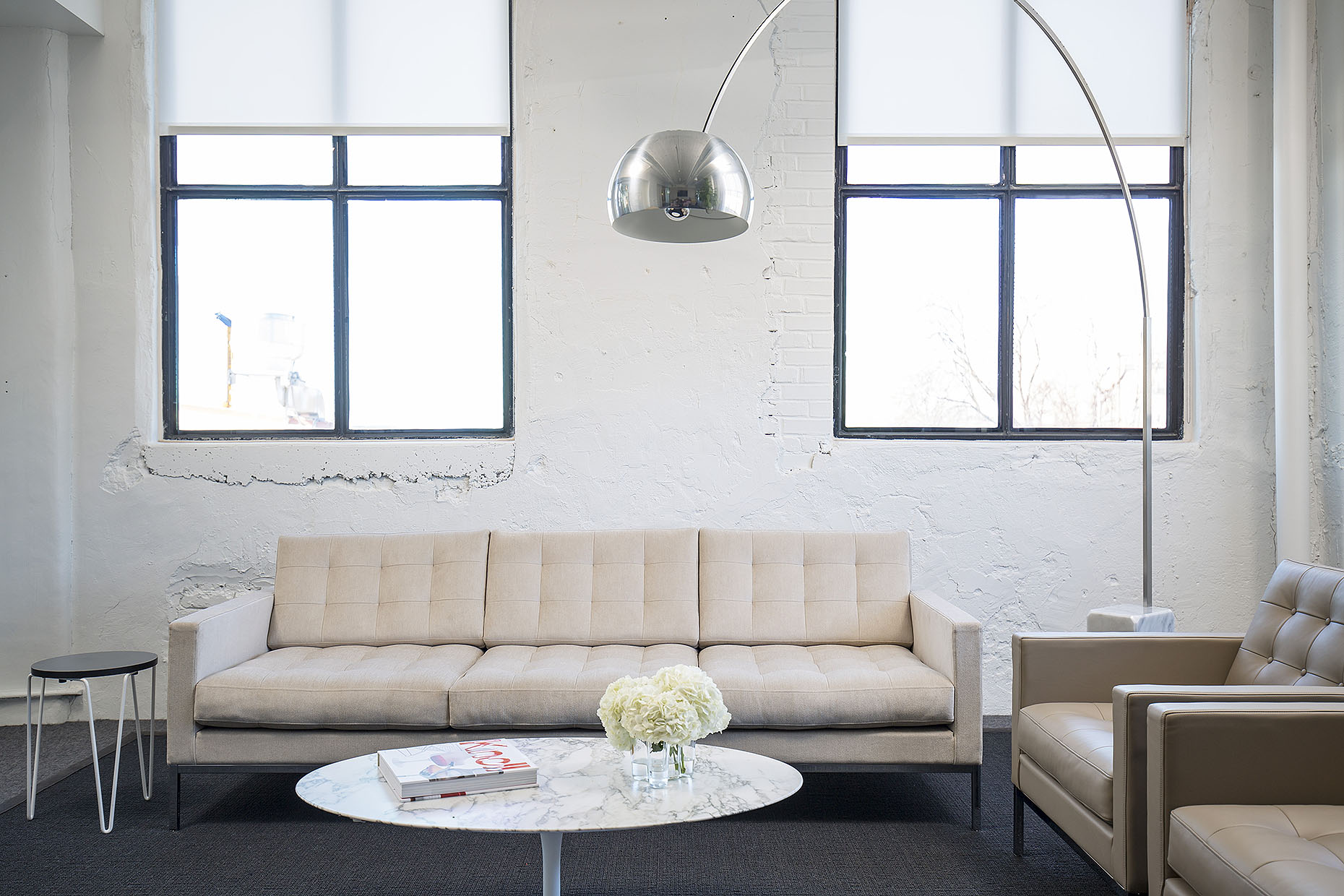
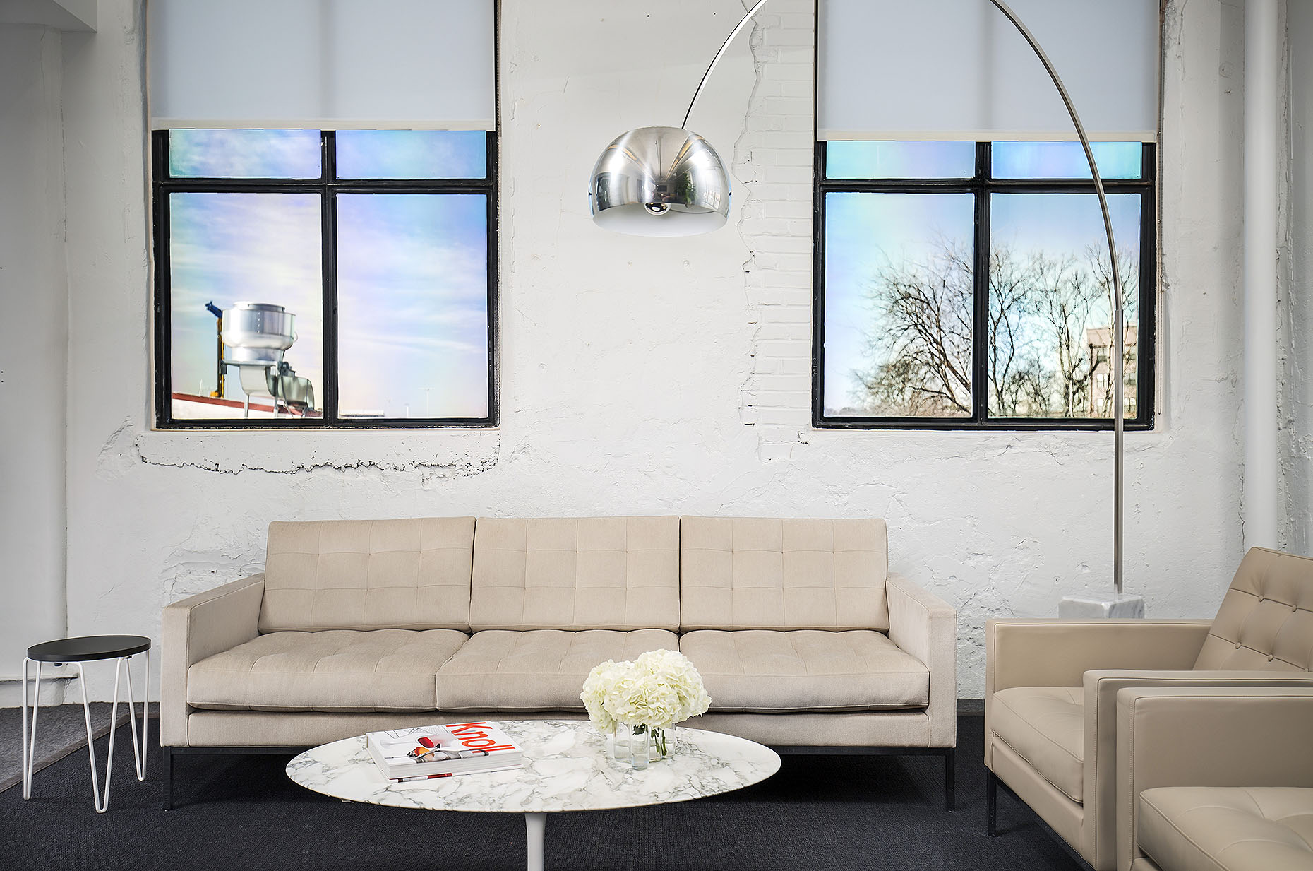
During this shoot, the second end table had not arrived yet so we moved the one that we DID have to both spots, took separate photos of them, and then blended them in post-production.
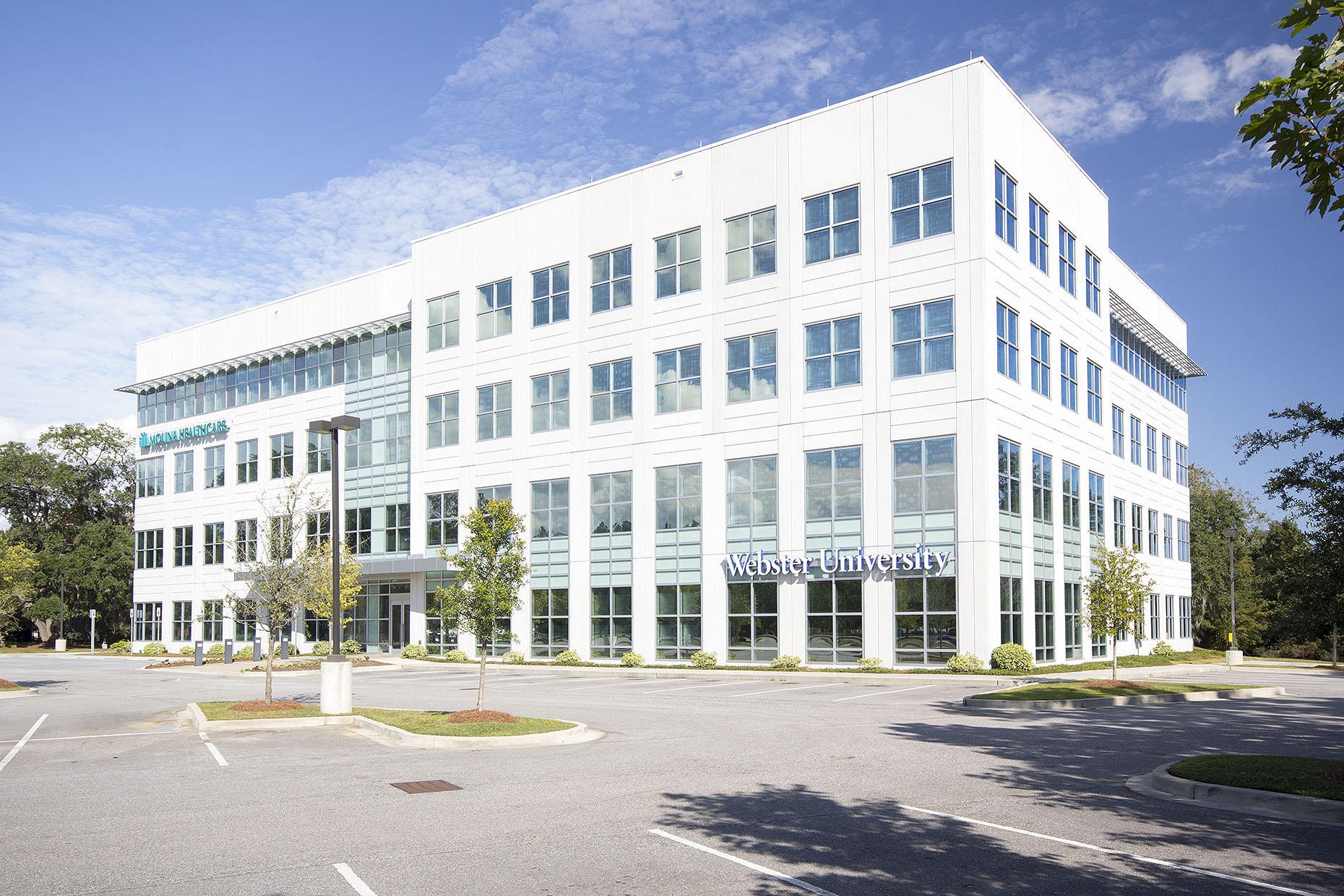
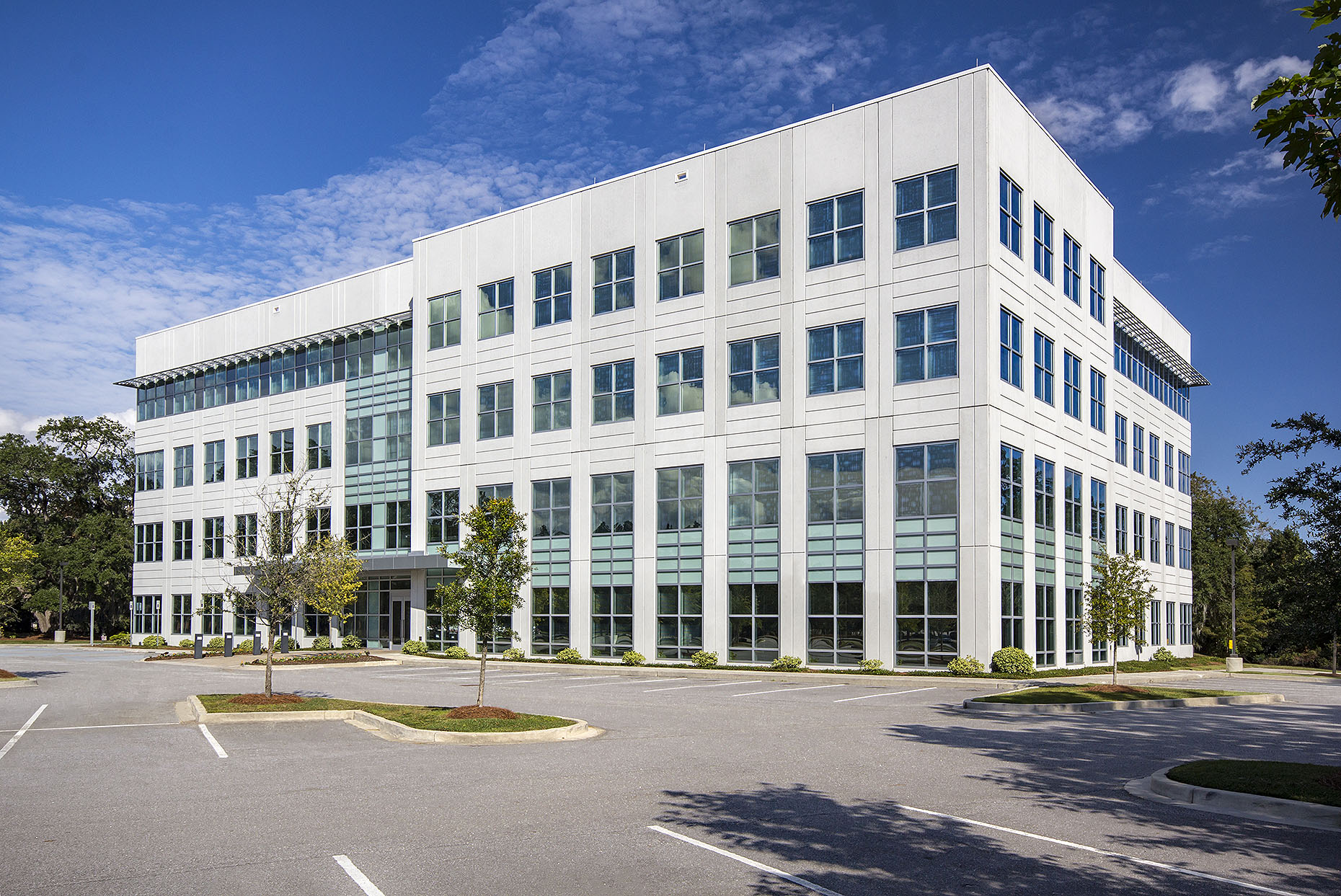
In addition to removing debris and distracting lamp posts, this is an example of when the architect did not want signage to be seen on their building.
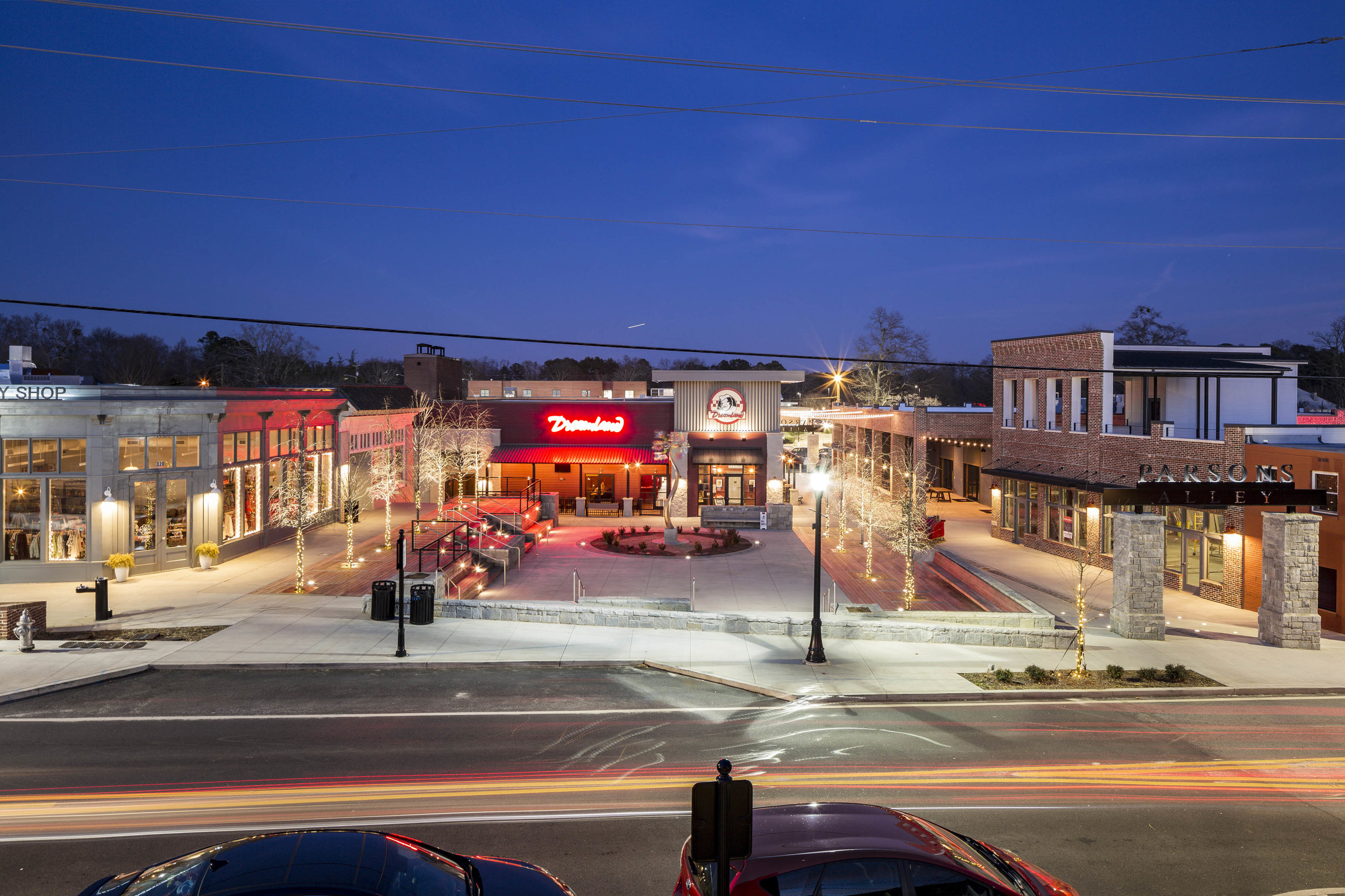
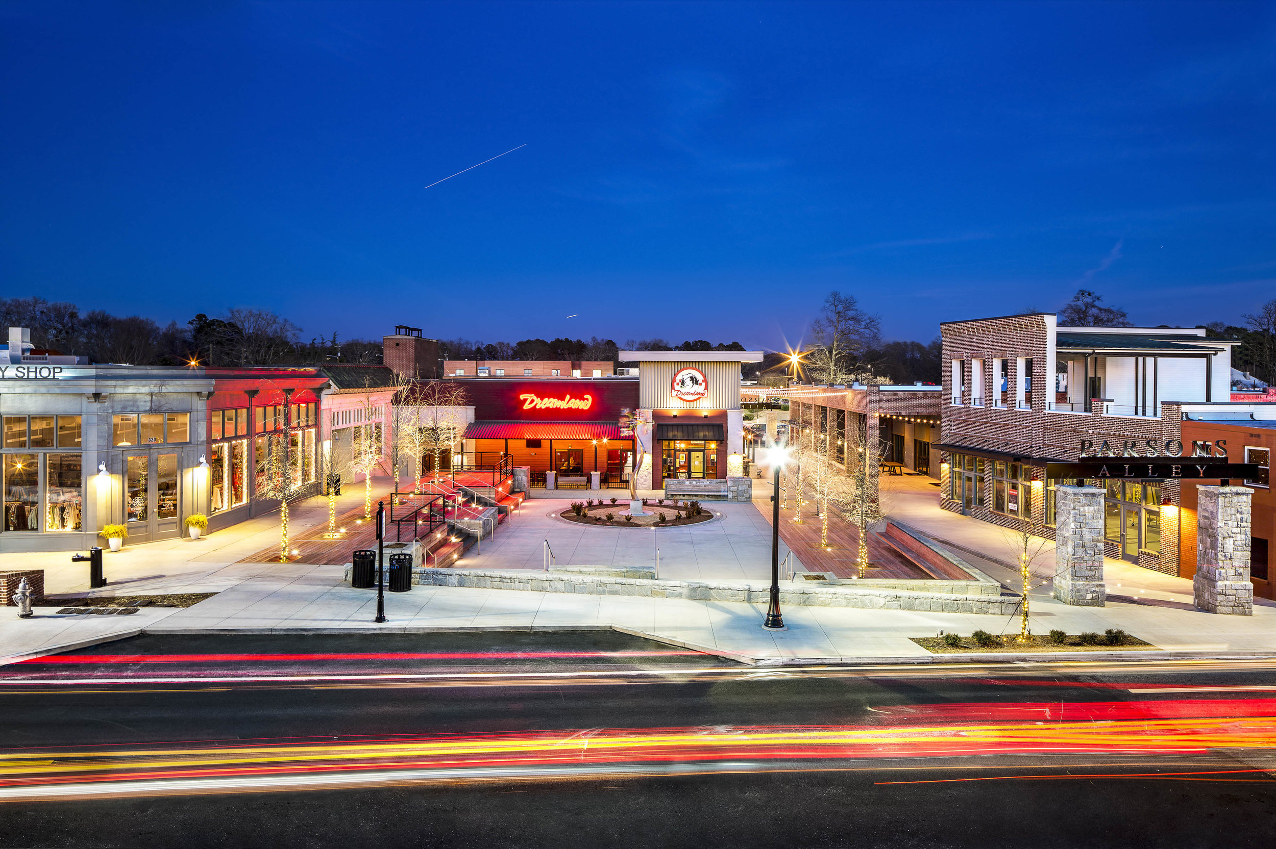
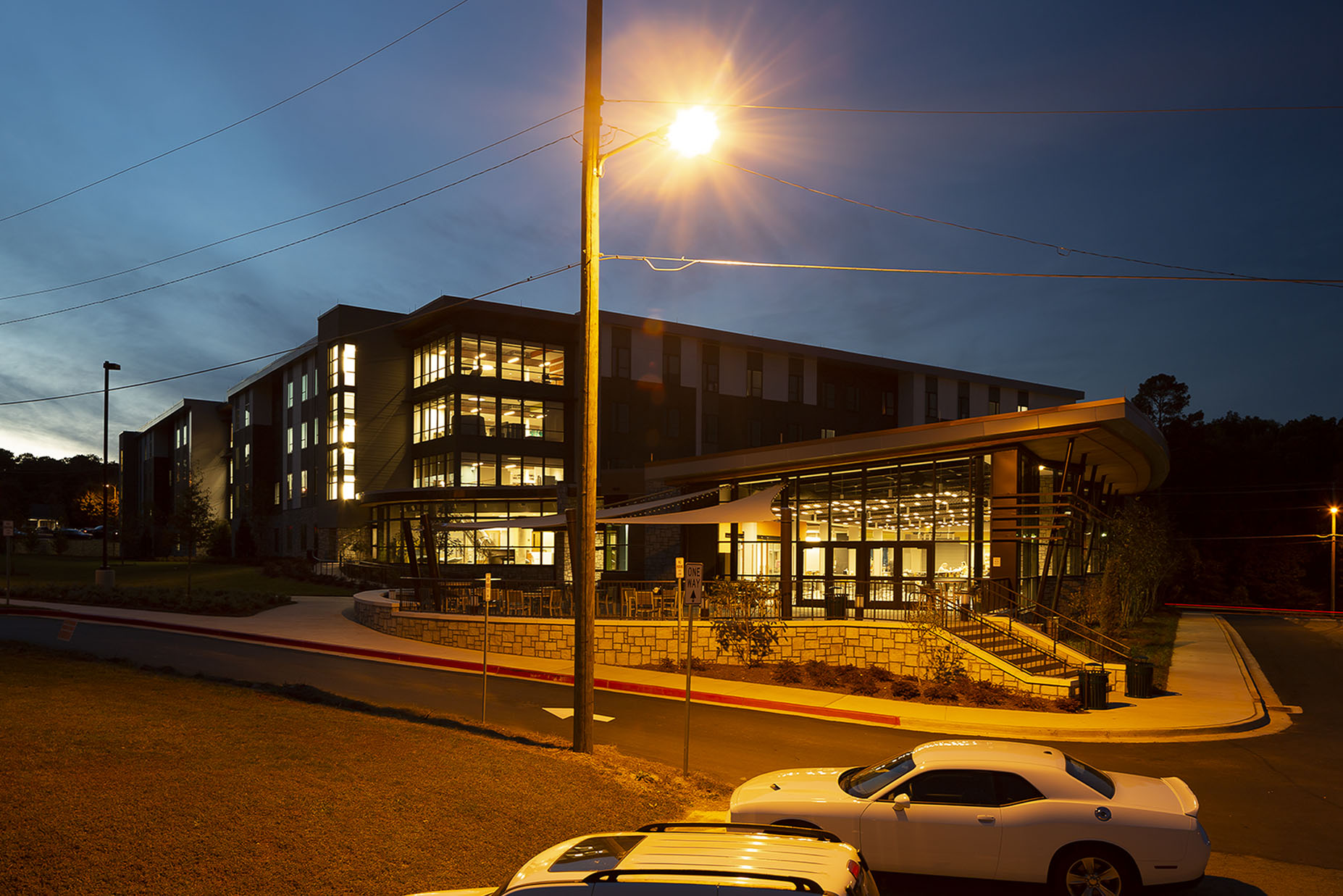
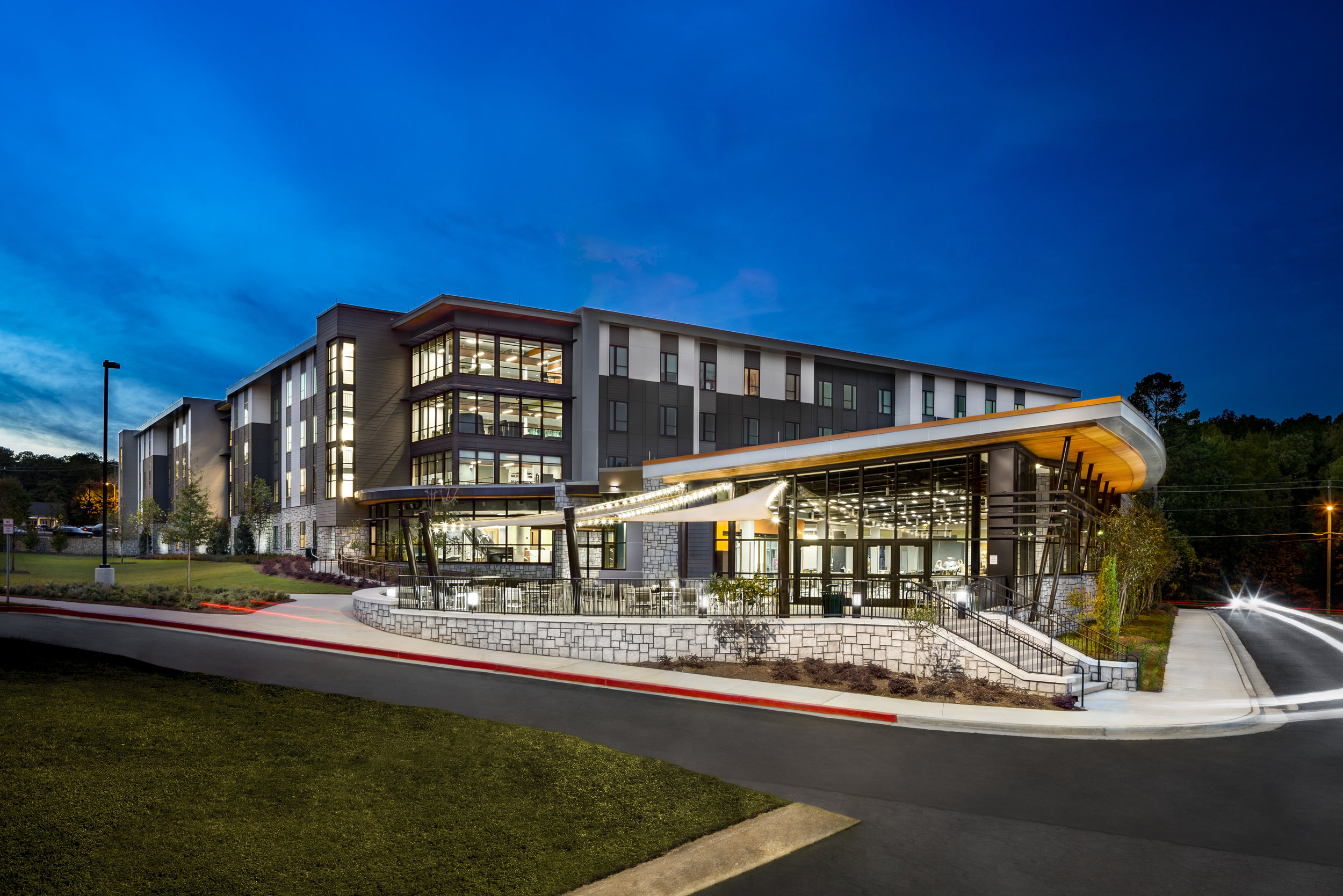
Power lines blocking your building? No problem.